Abstraction

The White Paper Test
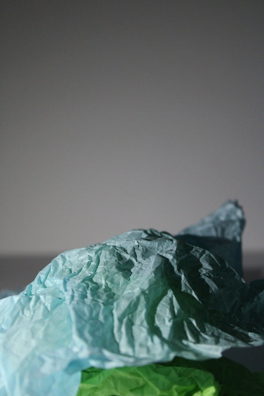
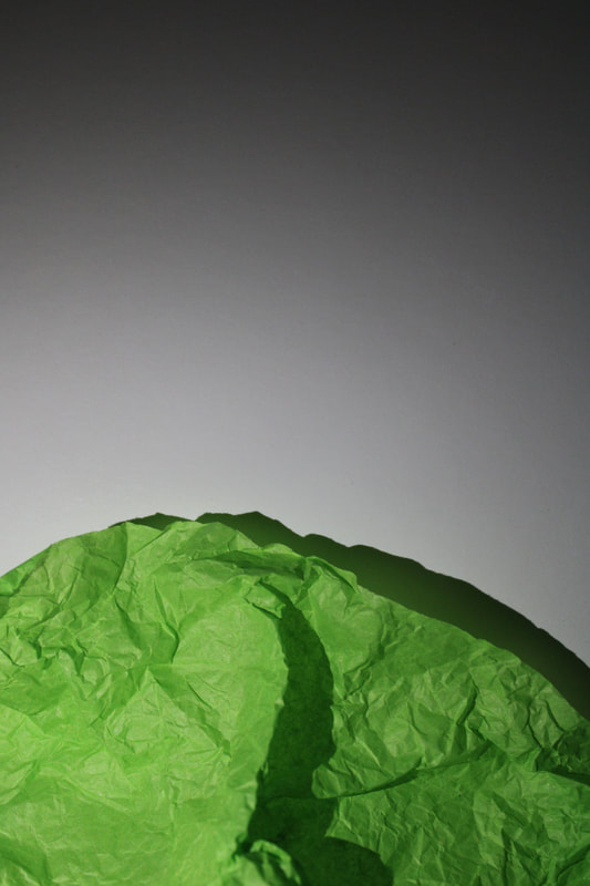
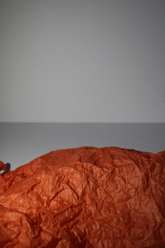
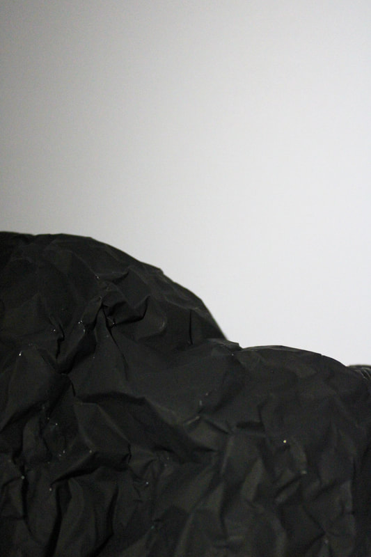
For this task we were asked to create a series of at least 24 images using one single piece of paper and a flashlight. To do this we used a white and a black background, when starting off I did not crumple up the paper immediately and tried to get some shots of the paper folded over. After taking a few images like this I then crumpled up the paper, I found this made the images come out much better as the creases in the paper formed nice shadows and gave it texture, it made the image more interesting too look at. I took several photos, and for some I used a colour gel too go over the flashlight to highlight some colours on the paper.

|

|

|

|
My response
Below are 4 images that I liked the most out of the pictures I took, as you can see most of them are using the black background and the one orange one is using the white background. Originally I thought I preferred the white background most because you could see the shadows in the background as well as on the piece of paper. However once looking over all the images I shot I found that I preferred the black background, I think it emphasises the colours and makes the paper appear more ominous like you can't quite figure out the scale of it. Also because there are no shadows in the background its almost like the paper is floating which I really like.


|


|
Artist response
Brendan Austin - paper mountains
Brendan Austin is an American photographer who's project paper mountains was inspired whilst walking through the forests in New Mexico. He wanted to explore ideas that provoke the questioning of truth in photographic reproduction, blurring the boundaries between fiction and non-fiction. In this project he attempts to build a alternate nature.

|

|

|
Above are examples of his work, I chose these because I like how the paper used even has the colouration of a mountain. The way the paper is positioned gives the landscape feel like you are looking at a piece of nature, it tricks the eye. The colouration on the paper also allows this illusion more as the colours are very similar to those of what could be on a mountain, this is most evident in the last image on the right. The grading of the light also adds too the gritty type texture to the paper.
Contact sheets from my shoot

|

|

|
My Response
For my response I chose to use coloured tissue paper, I chose this because when crumpled up tissue paper has so many little defined lines which gives it really nice texture, much like a mountain. When taking the images I aimed too leave as much negative space upon the tissue paper mountain I like how this gives it more of a mountainous effect. My images are not identical too Austins work but I think I did a good job at capturing some sort of landscape form.
|
|

2nd Artist Response
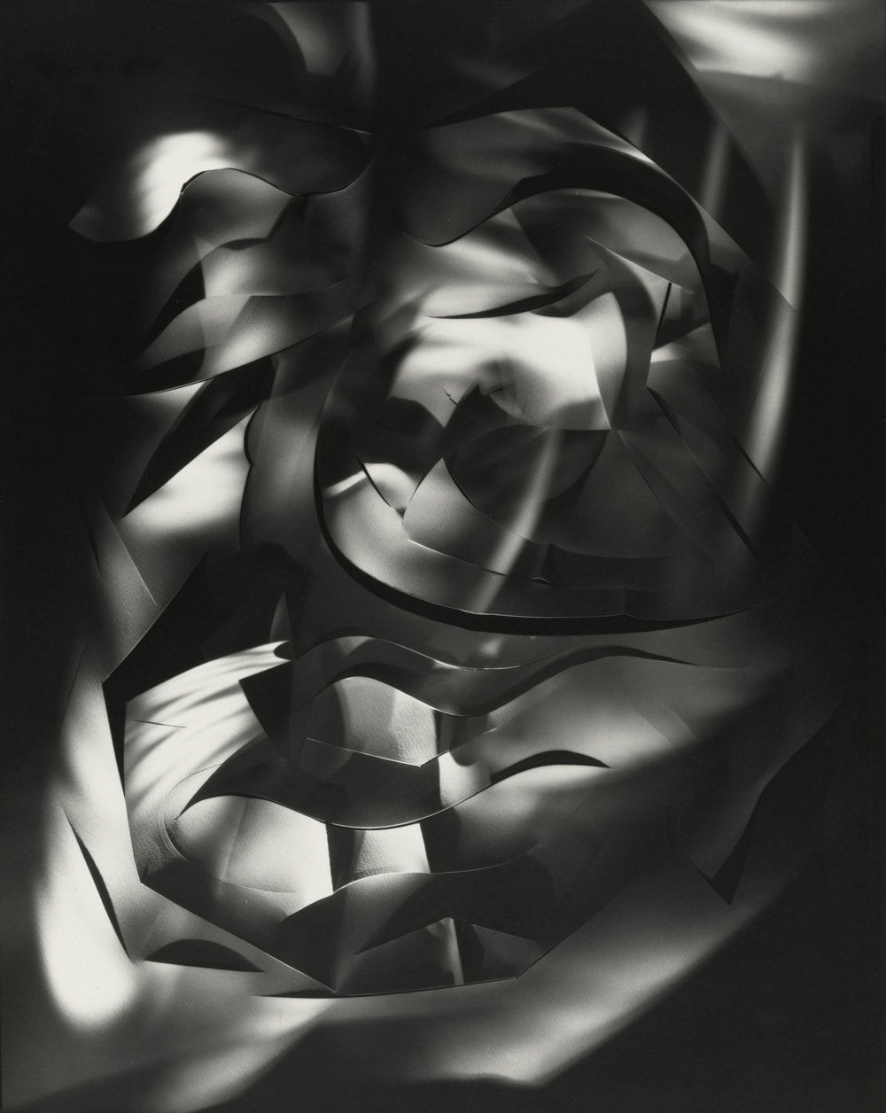
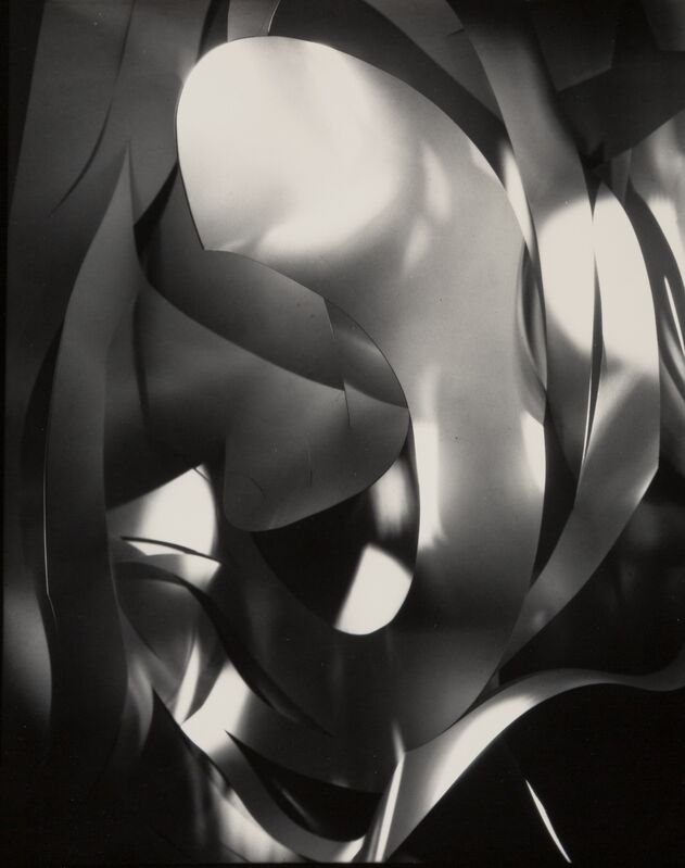
Francis Bruguiere - cut paper abstraction
Bruguiere created twisted and unnatural worlds with his photographs, he did this my twisting and deforming paper and then shining a single light onto it in different positions. This creates many different unique shadows going in and out of the gaps in the paper.
|
|

|
I chose the above 3 images of his because
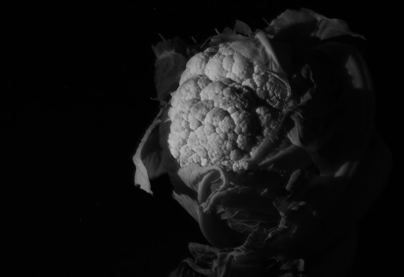
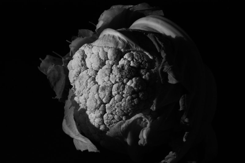
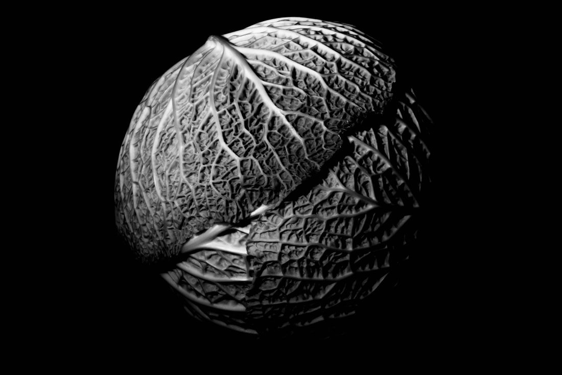
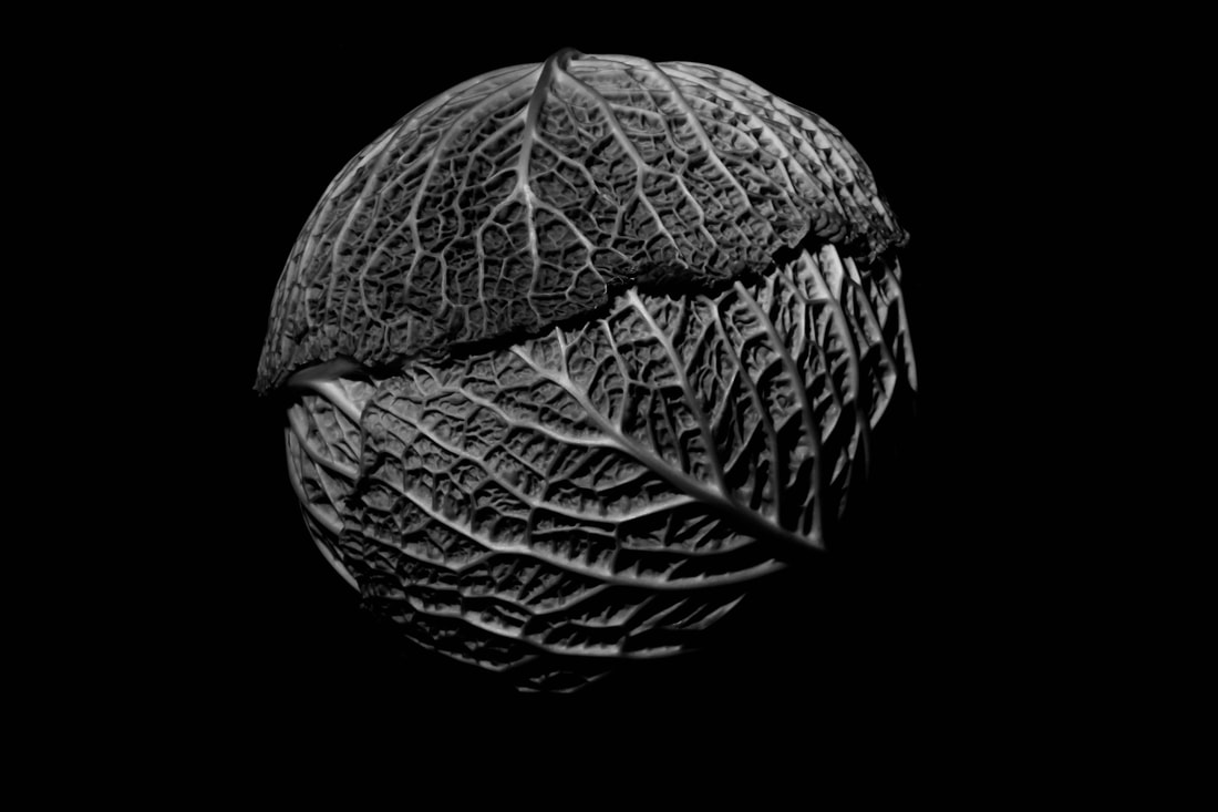
Edward Weston
Ordinary vs Extraordinary
Edward Weston was a 20th century photographer, Westons photographs transformed everyday objects into abstractions of shapes, shadows, and patterns. When taking his images he used an aperture of f/240

|

|

|
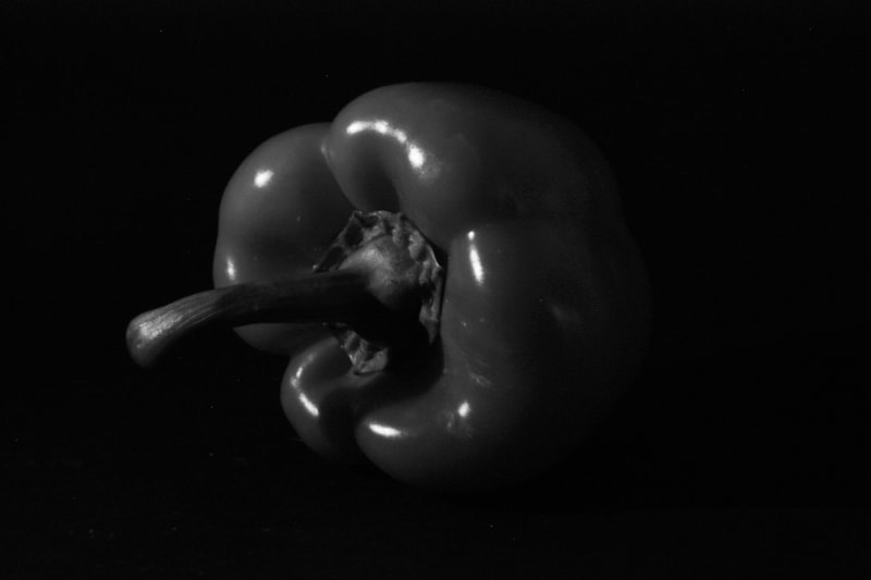
Above are examples of his work that I liked, all three images make everyday objects appear interesting and captivating too look at. For example the lettuce leaf is composed very well it takes up the space of the photo and also leaves room for it tooklook like its disappearing into the black background, this is what gives it the abstract feel. I also really like how you can see everything, there is so much texture on it and the image is crisp and clean. I also really like the first image of the pepper, the shadows shape it very nicely
Contact Sheets from my shoot

|

|

|
My response
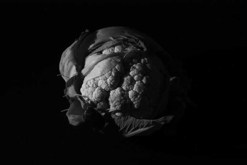
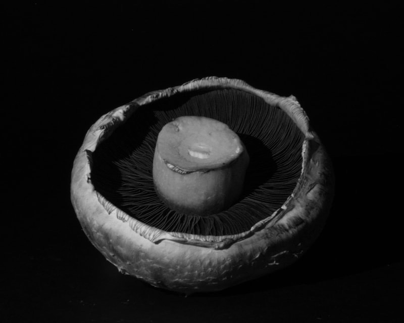
For my response I used a black background and set up my camera on a tripod so that it was completely still with my phone touch shining at the object. It needed to be completely stills I was uses the highest aperture, resulting in a longer shutter speed so any movement would cause the image to be blurred. I used an ISO of 100 to get a clear image so that there wasn't any grain. I positioned different vegetables on the background, I chose the vegetables with the most texture I think this makes the image more captivating. I am happy with how some of my images came out I think I captured images similar to Westons.
However when photographing objects like the pepper I struggled, I found it hard to make it appear interesting as it has not as much texture as for example the cauliflower. I decided to try just capture the curves that it has and too use my light too create nice shadows over it. I also don't like how the cabbage leaf photo is composed, I haven't used the space correctly, by cropping the bottom of it I've made the image look messy.
Once I upload my images top the computer I found that lots of them where blurred, I wasn't too sure how this happened as everything was completely still but I managed to find a few that where in focus and that I liked. I then went into photoshop and edited them into black and white I also upped the contrast and brightness on most of them, this helped define all the shadows and marks in the vegetable.
O
|
|
Second response
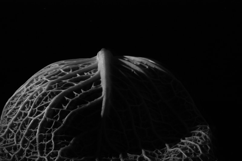
For my second response i chose to focus on the cabbage more and wanted to improve my first image i took of it. I prefer these images much more as they are composed much better compared to my first response and the detail and texture of the the cabbage and broccoli is emphasised much more.

|


|
Abstract comparisons
Body and Nature - Alicja Brodowicz
Brodowicz is a Polish photographer who focuses on the similarities that the human body and nature have. She looks closely at textures, lines, and compositions and then places them next too each almost like they're in' unity ' , humans are apart of nature and lots of body parts can have a strong resemblance to parts of nature. She then puts the images in black and white which really enhances the detail and textures in the photos. The black and white also adds a sort of eerie feel to the images.

|

|

|
Here are examples of Brodowicz's work that i liked. As you can see she has found parts of nature that strike a resemblance to parts of the human body. I find the first image
My response
For my response i went out into my garden and photographed multiple different pieces of nature that i thought could somewhat resemble a person. I then decided to take images of my granny to compare with the photos i took outside. I chose my granny as her skin is textured therefore has much more of a resemblance to things like creases in a piece of bark or veins in a leaf . Below are my top 4 comparisons i took.
I think i successfully took a series of images that follow brodowicz's work and i am happy with how the images turned out, however i feel they don't have the same eerie feel that her work has but i did capture successful comparisons between the body and nature.
I think i successfully took a series of images that follow brodowicz's work and i am happy with how the images turned out, however i feel they don't have the same eerie feel that her work has but i did capture successful comparisons between the body and nature.


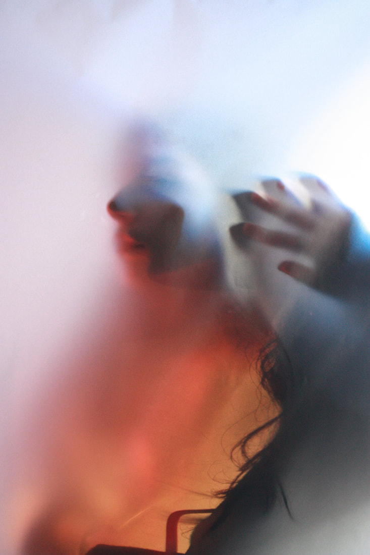
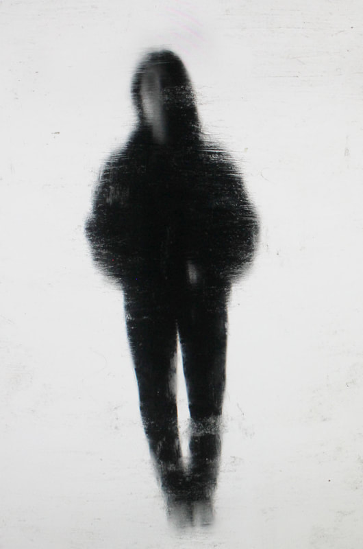
Abstract Portraits
Bill Jacobson
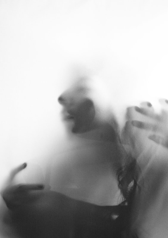
Bill Jacobson is an American photographer who focused on portraitures in 1989. Jacobsons project 'Interim portraits' focused on pale, shadowy, out of focus portraits of figures. These images focus on fleeting memories and inner states rather than clear representation and recognition . 'Interim portraits' features these pale shadowy figures to evoke the loss experienced by many during the height of the AIDS epidemic. The blurred subjects underline the futility of capturing a true human likeness in both portraiture and memory.

|

|

|
I chose these three images by him because in each image the model is distinguishable yet blurry, you are still able to make out the models face. For example in the first image, it is very blurred but you are able to make out that it is a face. The man has a almost shocked look on his face, i feel this adds to the meaning behind the images, like he's a memory slowly disappearing. In the other two images you are unable to see the persons face but you can still see a blurred version of their body. In the middle image he appears even more blurred and further back like he's slowly fading away into the white background, he also is wearing white shorts so it almost looks like he is just a torso and a head. The last image is almost like the person is turning around to walk away into the white background, symbolising them as a memory.
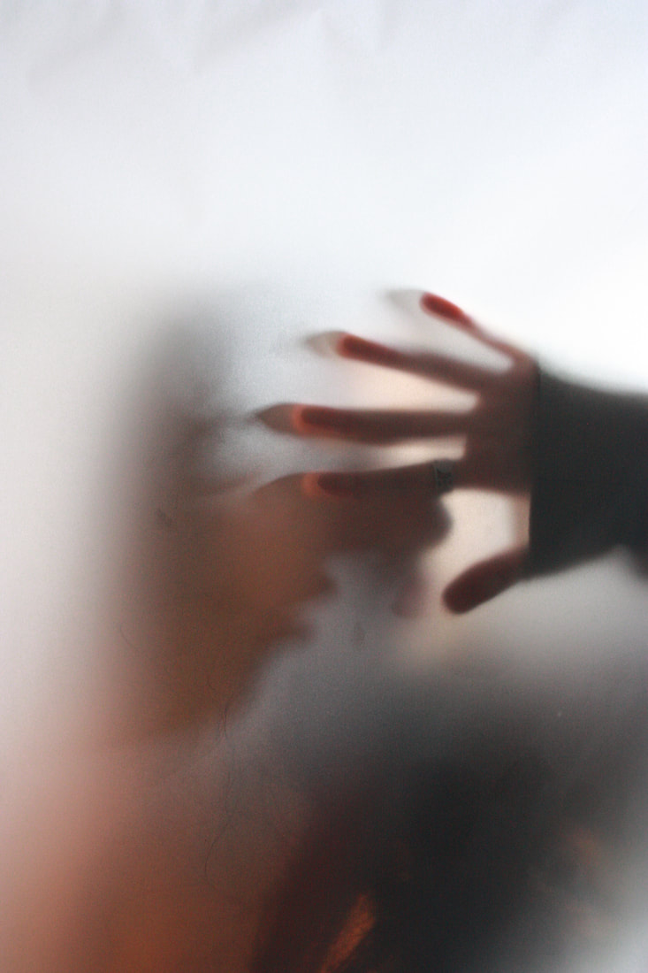
My Response

|

|
For my response I used tracing paper to create the same blurred effect like in Jacobsons work. I got my model to stand behind the paper and put her face up against it. However for my response i decided to use some gels over the light that was shining behind the models head. I found the colour added a different effect to the images, and added to shadows being created. Although i did change two of my favourite images from the shoot into black and white to resemble Jacobsons work.
I feel that |
For my response

|
|
|
Black and White edits

|
|
Erwin Blumenfeld
Erwin Blumenfeld was born in Berlin and emigrated to American in the 1940s, soon after moving too America he became a successful fashion photographer. Blumenfeld used experimental techniques when capturing his photos, such as multiple exposures, solarization, and photomontage into his darkroom pieces.

|

|

|
Above are three images of his that i liked. Here you can see his experimental techniques as he uses the mirrors to distort the models faces, the effect of this makes it look as though the parts of the models face are in the wrong place, or there is more than one of her for example the middle image. In the middle image it looks like there are multiple images in a sequence of the model moving from standing face on too sideways. The lighting
My response

|

For my response i used similar distorted glass like in Blumenfelds work which i then got my model to hold up in front of her face. I decided to add colour too the lighting for my response, i liked how this added a sort of divide down the middle of most of the images and how it gave another level of distortion. I definitely prefer the images with the dotted glass rather than the one with the lines, i think they came out better and look more interesting and different to look at. I think the coloured lighting really added to these ones because you cant see the features of the face properly the lights add a sort of structure too it and it makes it easier too make out the face. I feel i could definitely improve this shoot by taking more images and experimenting with different glasses to distort the face, and also different types of lighting.
|
Edits

|

|

|

|
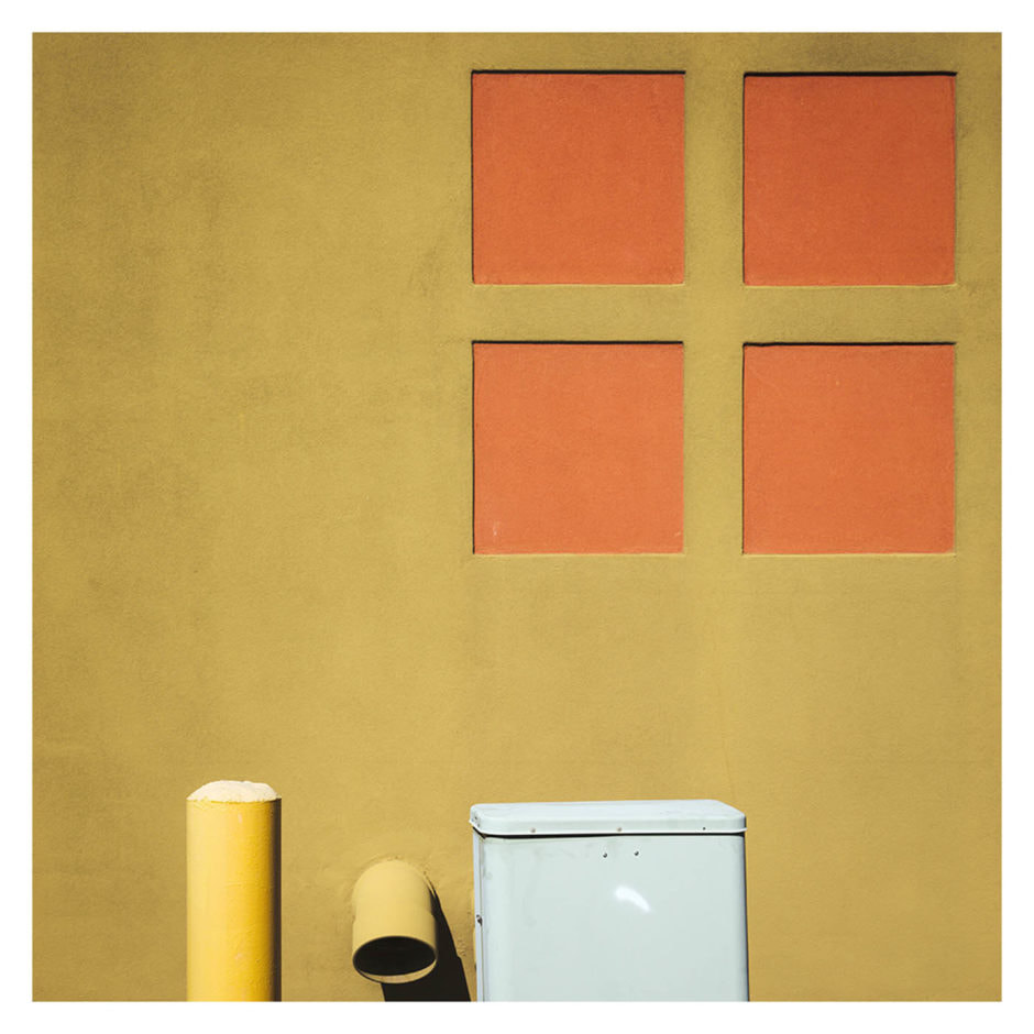
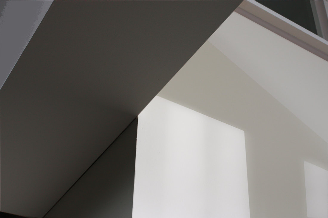
Johnny Kerr - Ambiguity
Johnny Kerr is a fine art photographer based in Arizona. Kerr creates abstract images of walls and buildings focusing on how the sun changes the shape, form, and texture of them. He watches too see how the shadows can create ambiguity.
|

|

|
Above are three examples of his work, here you can see how the shadows change the form of the buildings and leave us wondering what exactly are we looking at.
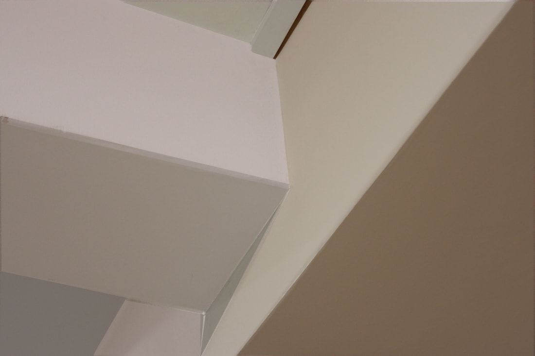
My response
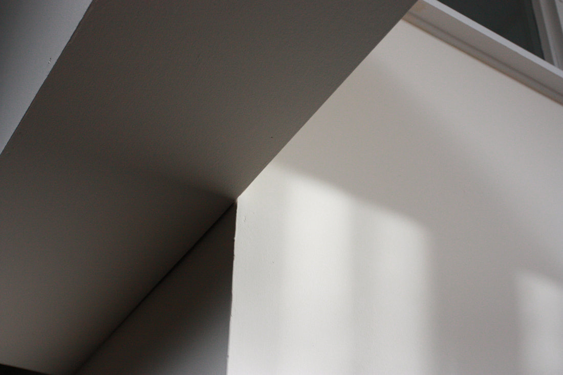
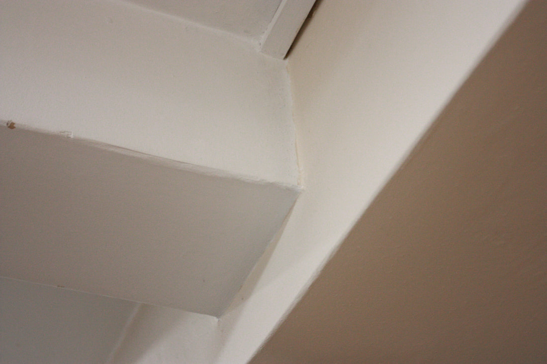
For my response i went around my school and photographed different areas of the school buildings, trying too look for harsh corners or places with different contrasting shadows.
|
Before

|
After

|
At home response
|
Before

|
After

|
Abstract Environment
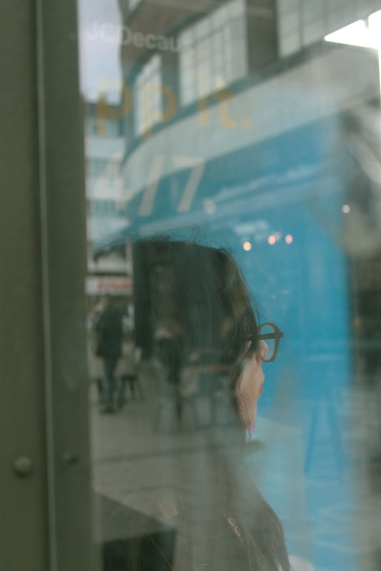
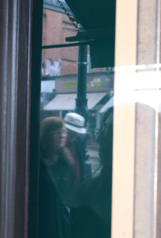
Saul Leiter
Saul Leiter is an American photographer and painter whose early work in the 1940s and 1950s was an important contribution to what came too be recognised as the New York school of photography.

|

|

|
Above are three images of Leiters work, i like how all his images tell a story and capture casual moments in peoples lives.
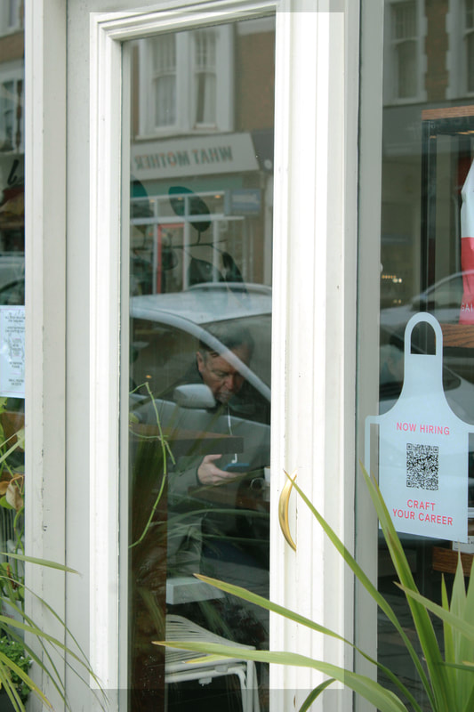
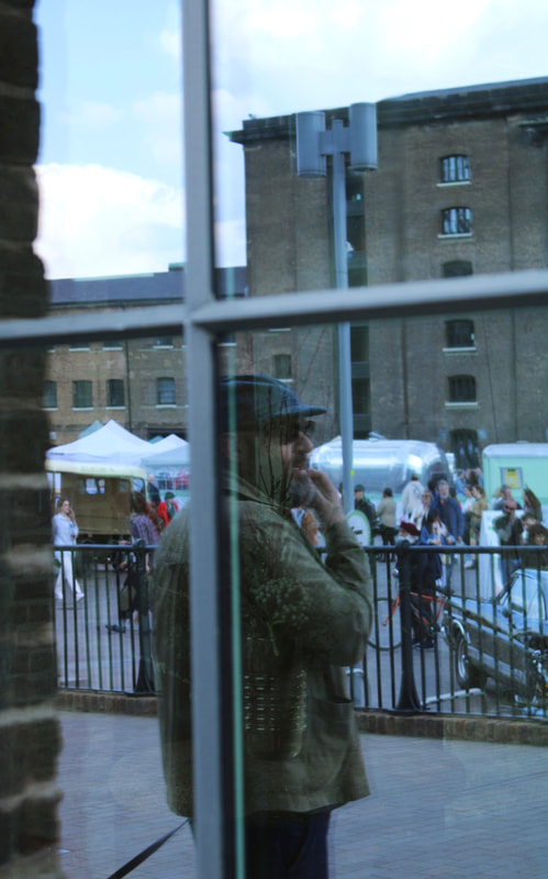
My response
For my response i walked around my local area looking for reflective surfaces, mainly windows, too capture images inspired by Leiters work. I began by taking images of my classmates being reflected in shop windows, Leiters work is casual and i wanted to replicate this in my work. To do this i got my classmate to look away from the camera as if they were doing something giving it a more 'caught off guard' look, i then began too take pictures of passers by on the street. For example the 2 middle images below i took of strangers sitting in shops going about their everyday lives, i like these images alot and i think they reflects Leiters work nicely.
Once i had taken enough photos i was happy with i then began to edit them in photoshop, when editing i had to decide if i wanted to go with warm more orangey yellow tones to put over my image, or more green tones. I decided too mix up both for what suited the image best, for example two middle images the one on the left is more green and the one on the right is more orange this was really a personal preference.
Once i had taken enough photos i was happy with i then began to edit them in photoshop, when editing i had to decide if i wanted to go with warm more orangey yellow tones to put over my image, or more green tones. I decided too mix up both for what suited the image best, for example two middle images the one on the left is more green and the one on the right is more orange this was really a personal preference.
Contact sheets

|

|

|

|
EDITS
|

|
|
|
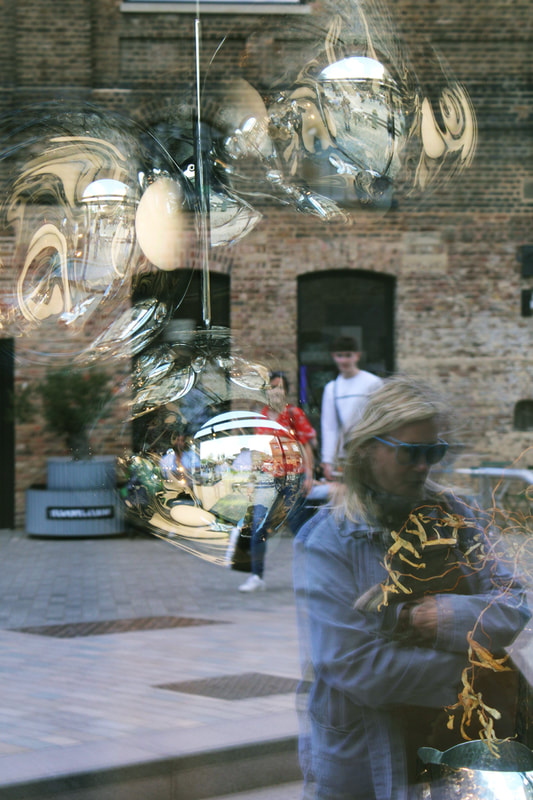
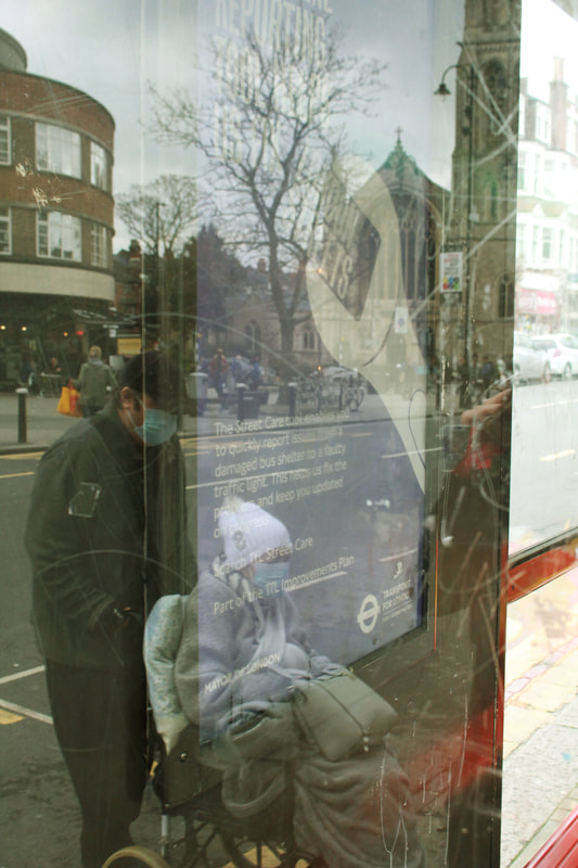
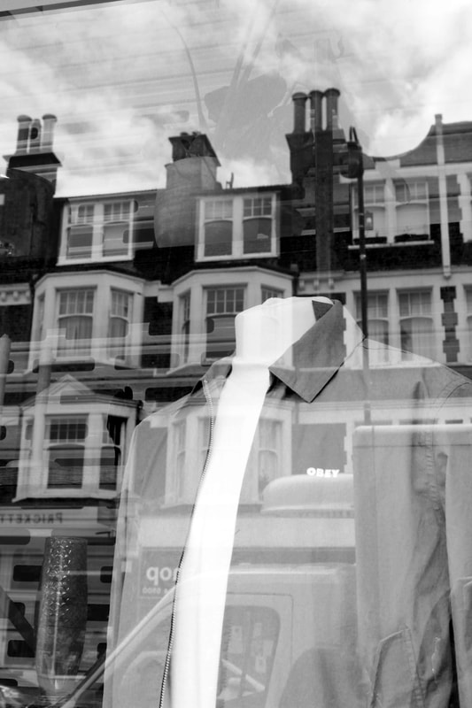
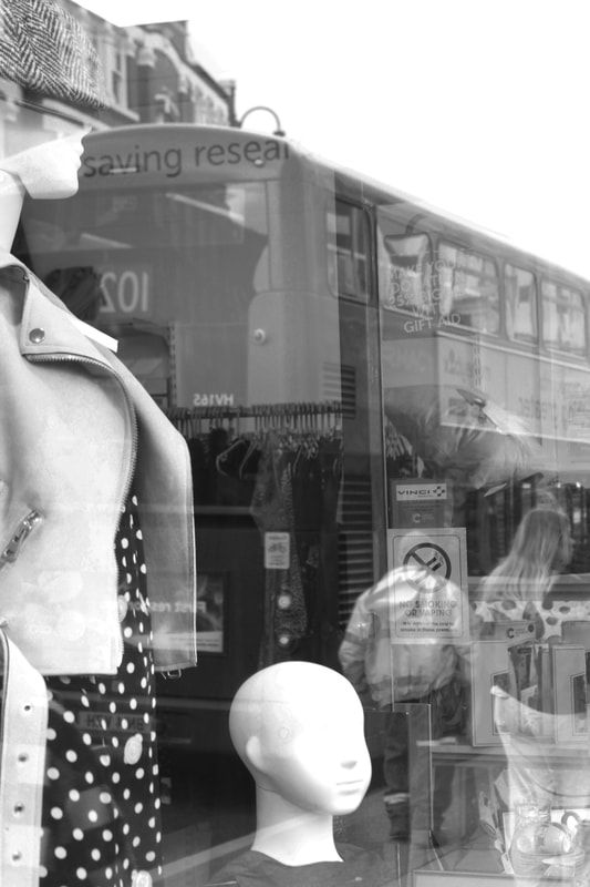
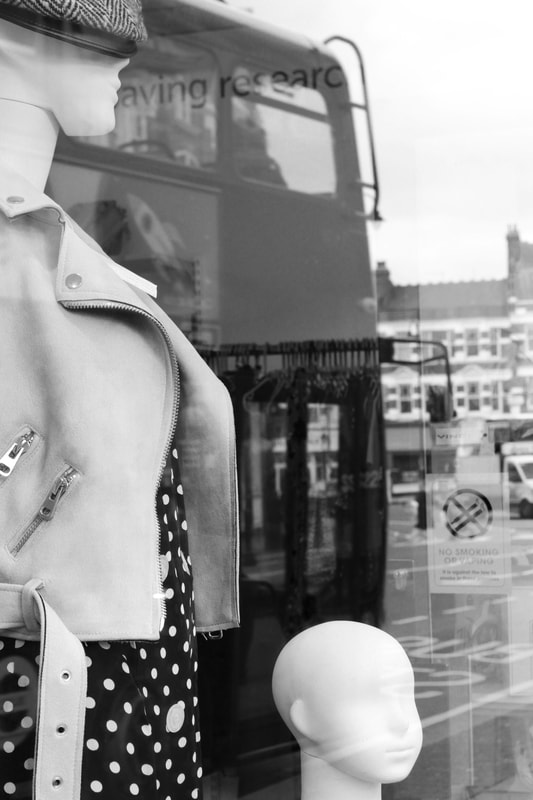
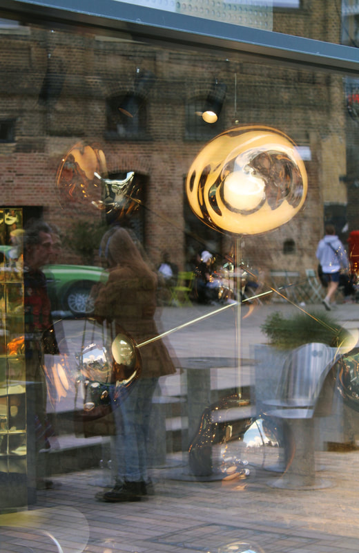
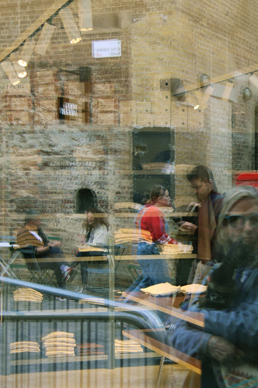
Lee Friedlander
Lee Friedlander is an American photographer who photographed mannequins in shop windows while also capturing the reflection of the roads, people or buildings opposite.

|

|

|
My Response
For my response i went around my local area looking for shop windows with mannequins in, i found many and started to photograph them. I made sure i got all the different types of reflections in the image making sure to include the inside of the shop as well as the outside. You can clearly see this in the top right image, you can see the clothing rack on the inside of the shop as well as the bus that was opposite the shop window. It almost looks like the clothing rack is printed on the bus, it is hard to decipher what is where. I then went into photoshop and turned the images into black and white like in Friedlanders work, i upped the contrast which then enhanced the reflections.
I think my images came out well and i am pleased with them, however next time i would try too take more images as i failed to take a large amount.
I think my images came out well and i am pleased with them, however next time i would try too take more images as i failed to take a large amount.
EDITS
|
|
Chemigrams
Pierre Cordier
Pierre Cordier is a Belgian artist who discovered and is a pioneer of the chemigram and its development as a means of artistic expression. He discovered this technique in 1956 , the chemigram combines the physics of painting and the chemistry of photography without the use of a camera, englarger, and in full light.

|

|

|
My Response
For my response i used a many different types of resists, such as honey, Vaseline, cooking oil, and hand cream- as well as coffee granules and salt which stuck to the sticky substances on the photographic paper. I also used the fix and developer in a spray bottle to spray in certain areas and keep what i wanted to change colour in more concentrated areas. I also used masking tape which had an interesting effect you can see this in the first image on the left below,


|


|
Three Strands
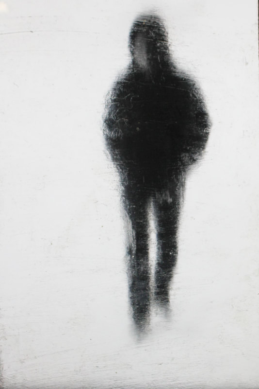
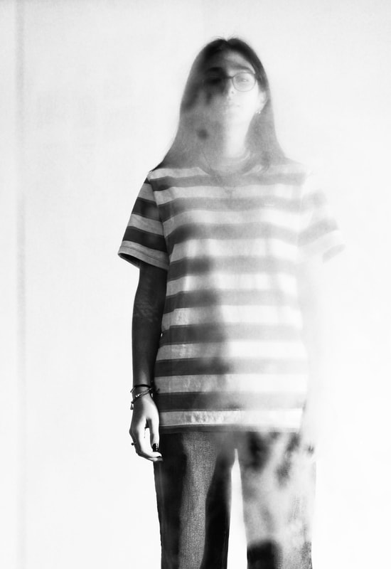
Strand 1 - John Batho
For my first strand i chose too look at the work of John Batho and his series of work called 'present and absent' . In his series he photographed people in front of a condensed window creating ghostly figures.

|

|

|
My Response
For my response i started off my taking full body images of my model in front of a white background, at first i struggled to think of a way to create the same effect that Batho has on his images. So i tired to come up with different ways of doing it, the final decision was too upload the images onto my computer and photograph them off my computer screen with a piece of glass in front of it which was covered in vasaline, this sort of created the same ghostly blurred effect that Batho has in his images. However it was very hard to get a focused image where you could also sort of see the models face like in Bathos work, the people are still sort of visible. Also because i photographed off of my computer the image is not of high quality. I then went into photoshop and played around with the contrast and brightness of the images with the glass layer.
Original photos before adding blur

|

|
Edited
|

|
|
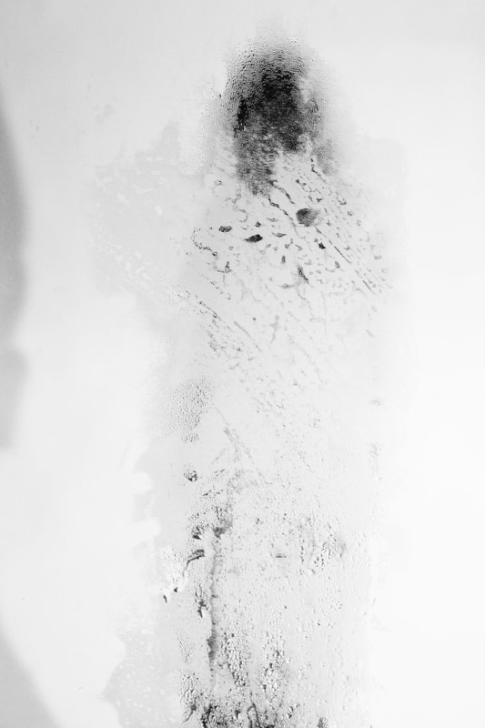
A different approach:
Below are a few images from my second approach to create the same condensed window effect that Bathos work has. To do this i used a kettle and a piece of glass to create my own condensed window, i boiled the kettle below the glass and had my model stand behind the glass.
Between the two attempts i prefer the first as i feel it reflects Bathos work more, the second attempt was tricky as the steam didn't form in the same way it does in Bathos work, and it completely covered the model. The first image below works somewhat better than the other two as you can see that there is a blue but you can also see her face. However it would look better if it was more blurred.
Between the two attempts i prefer the first as i feel it reflects Bathos work more, the second attempt was tricky as the steam didn't form in the same way it does in Bathos work, and it completely covered the model. The first image below works somewhat better than the other two as you can see that there is a blue but you can also see her face. However it would look better if it was more blurred.
|
|

|
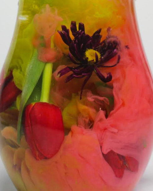
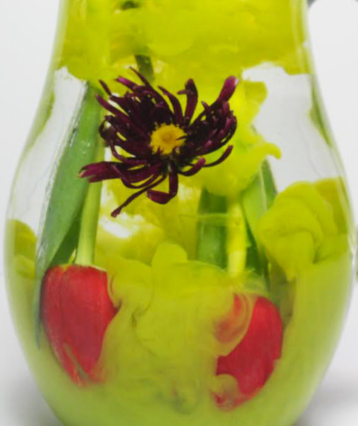
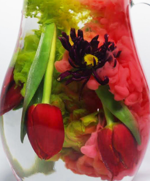
Strand 2 - Sandra Madelane
For my second strand i chose to look at the work of Sandra Madelane. Specifically her 'flower series' , Sandra Madalane is a London based fine art photographer. Her 'flower series' started with an idea of capturing everyday beauty after the world was closed down due to the pandemic. To do this she played around the idea of gravity, suspending items mid air, and submerging flowers in a water mass. The end result is a delicate portrait of nature

|

|

|
My response
For my response i used a jug of water, paint, and different flowers. To create the same effect in Madelanes work i
|
|
Strand 3 - Saul Leiter
For my third strand i chose to continue my response to Saul Leiter, i decided too do this because when we looked at his work for our set task i really liked his work and enjoyed taking the images inspired by him. His work is simple yet captivating

|

|

|
My response
|

|
Development


