Magnification
For my ESA (externally set assignment) I chose to 'explore the notion of Magnification' below is my pinterest board (linked) that i created, it is filled with images i felt inspired by and which i felt resonated with the title well.

Definitions:

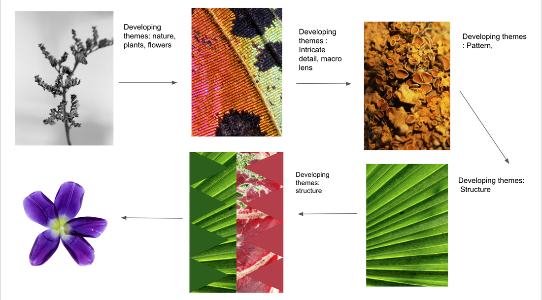
I chose to explore magnification as i felt it opened up many paths i could go down, when first seeing the word i envisioned extreme micro close ups of insignificant things and discovering the beauty in texture and things you can't see unless up close - i felt that their were many possibilities of what i could create
Galleries / exhibitions
Trip to Paris
While on a trip to Paris i visited multiple galleries and exhibitions. While looking around the different galleries I looked for bits that could fit in with my title. I took close up images of sculptures or paintings with nice textures, or pictures of different sculptures that had different scales etc. I found the exhibitions at Bourse de commerce quite influential and helped inspire me with my first strand on nature. There was one room that had lots of tiny plants like a singular leaf or super skinny twigs, these interested me and i attempted to take some close up images of them.
The first images in the slides are sketches i did of certain sculptures or of patterns and shapes that were present in some of the artwork, some relate to my word of magnification for example the first two sketches within my drawing i magnified what i was looking at in the artwork or made a collage of all the little and big shapes that were present.
The first images in the slides are sketches i did of certain sculptures or of patterns and shapes that were present in some of the artwork, some relate to my word of magnification for example the first two sketches within my drawing i magnified what i was looking at in the artwork or made a collage of all the little and big shapes that were present.
|
Pompidou centre
Rodin Museum
|
Mathilde Denize
Bourse de commerce
|
Three artists / three responses
Artist 1 - Karl Blossfelt
Karl Blossfeldt was a German photographer and sculptor. He is best known for his close-up photographs of plants and living things, published in 1929 as Urformen der Kunst. He was inspired, as was his father, by nature and the ways in which plants grow. “The plant never lapses into mere arid functionalism; it fashions and shapes according to logic and suitability, and with its primeval force compels everything to attain the highest artistic form,” he once said.
I was inspired by Blossfeldt's work as magnifies the sculptural qualities and textures within the plant, but the plant itself is also tiny normally a bud of the plant. I liked how he made smaller things look larger than they are in reality, I wanted to replicate this in my work.
I was inspired by Blossfeldt's work as magnifies the sculptural qualities and textures within the plant, but the plant itself is also tiny normally a bud of the plant. I liked how he made smaller things look larger than they are in reality, I wanted to replicate this in my work.

|

|

|
My response

|

|
My response included using the tiniest delicate flowers or plants that I could find and then enhancing and magnify the intricate details on them and making them appear larger than they actually are. To do this I took inspiration from Blossfeldt's work by capturing a very up close image of a very small part of a plant, to make these images my own I experimented with depth of field and also cropping the images to get an even closer image - eg the comparison below - this one worked the best as the plant I used was the right shape and has very intricate details within it.
|
Best extreme close up

Best edits

|

|

|

|


|

|

Artist 2 - Anastasia Pottinger
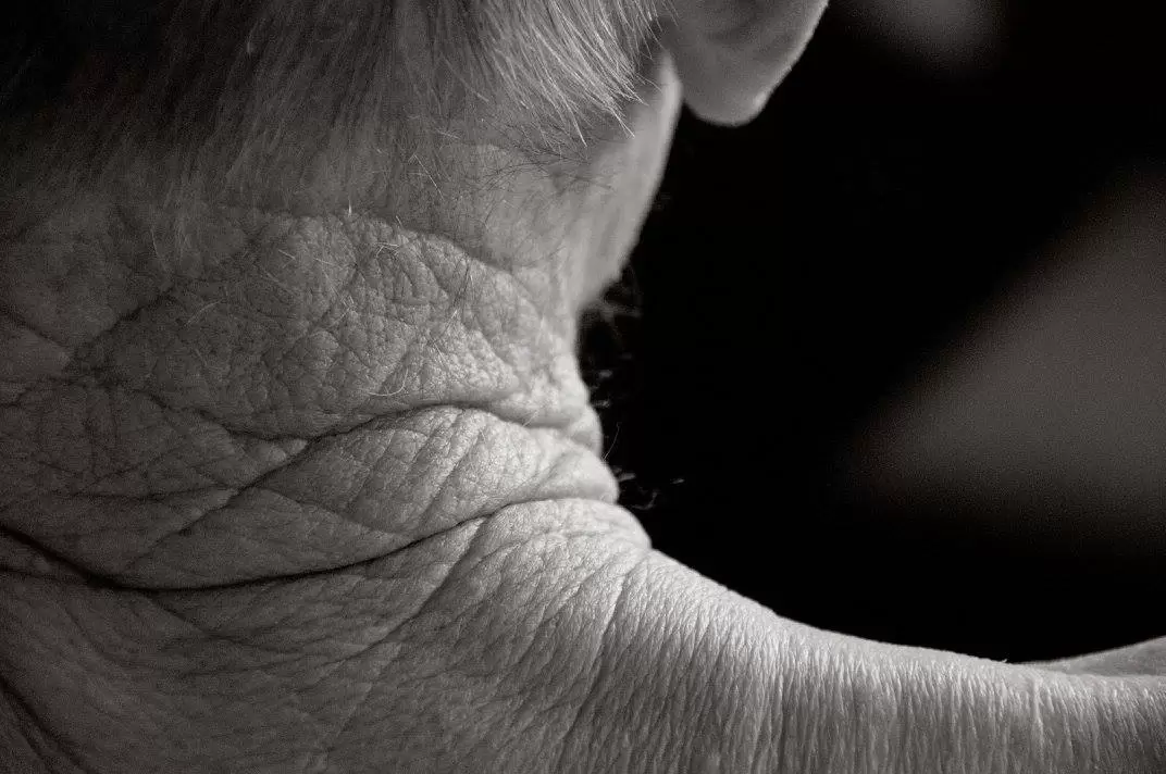
Pottinger was once approached by an 101 year old women who wanted her body photographed, and she wanted to keep her identity a secret. Pottinger was then approached by other elderly people who wanted their aged bodies to be documented. Her photography focuses on the small and intricate details within the skin and exploring the unconventional form of the human body. “Viewers are visibly moved by what they are looking at,“ claims Pottinger. “Whether it‘s wondering, ‚is this what I‘m going to look like?‘ or remembering a loved one – the response seems to be universally emotional on some level.“ I felt inspired by her work as she magnifies very extremely and captures immense detail.

|
|

|
My response
|
|
In my response to Pottingers work I used my granny to take photos of. She is not 101 but her skin has lots of texture and wrinkles which helped me when getting close up images.
I feel that the images that are out of context and that appear more obscure work the best. I think this is because it adds to the message that i wanted to bring into this project and the word magnification, making the image so magnified that it becomes ambiguous and it could be anything or in this case any part of the body. I am happy with how these images turned out because i believe i captured a detailed close up image that focuses on the texture of the skin. |
Best Edits

|

|

|

|

|

|

|

|
Artist 3 - Chris Perani
Chris Perani takes extremely magnified images of butterfly wings, and captures the microscopic details of dozens of butterflies. Within the images he captures the different variety of colours that are in the wings that create the buffer fly to look the way it does. You can also see all the individual hairs, I like they look like beads that have been sewed on. I was inspired by his work as it links back to a theme of nature and natural things that has continued in my strands, and I found his images very interesting. As you look at the extremely magnified images you almost don't know what you are looking at, i felt inspired by this obscurity.

|

|

|
My response
|
|
My response for this strand included using butterfly wings and getting an extreme magnification of them. My mum uses real (but dead) butterflies in her artwork so I had a few I could take pictures of. She gave me an iridescent blue one and then a more multi-coloured one. To take my images I used a macro lens so that I could capture the tiniest details within the wing. Beside this is a slide show of all the images unedited, as you can see I actually cropped the images in photoshop to get even closer and to capture even more detail. I used a bright light which covered the butterflies when taking my images, this also allowed for more colours to be present as the light affected the iridescent look of the blue wing. However in the larger unedited images you can see the lighting is slightly yellow as when i was taking the images it was dark so there was no natural light, in my second response i wanted to improve this.
|
Best edits

|

|

|

|

|

|

|

|
Extreme close up edits

|

|
Second response of butterfly wings
|
|
As a second response to my work on butterfly wings I focused on the lighting and exploring different colours. I feel that in this development I got closer than I did in my previous, and captured a nice array of colours. The multi-coloured butterfly pictures came out much nicer this time round, I believe this is down to the lighting. This time the lighting was more natural looking, i used a bluer light which translated nicer on camera and didn't make the butterfly look yellow. I really like the blue butterfly as you can see the individual parts of the wing in nice depth.
|
Best edits

|

|

|

|

|

|
Comparing the structure of the butterfly with structure of a hand
While taking the images of my grannys hands i made the connection between the veins on her hands and the parts of a butterfly wing. I decided to put two of them together side by side to show the comparison, the composition of the images is different but you can still clearly see the resemblance of the shapes and structure.

More structural comparisons in natural things


Magnification in nature
After evaluating my three strands i found that all of them had something in common, they were all of natural things being magnified. So i have decided to develop this all further, and using all aspects of my three strands to do so. I found that the images of mine that had little context because they were so magnified worked the best so i will continue to use this idea. I also want to focus on the different structures and patterns that appear in nature.
Inspiration

|
|
As a first development to the title 'magnification in nature' i took magnified images of some branches, twigs, and moss that i found in the woods and bought home to photograph. I have continued to use the macro lens for these images as i feel it captures the exact details i want, because in real life the branches are much smaller than those images beside show. I like these images and think the subject matter and idea is good, however i wasn't happy with the lighting. This proved an issue when i took some of my butterfly pictures as well, the natural light outside was very dark and gloomy so i had to use a light. This light was quite yellow so made the branches appear a stranger colour than they actually are. I may do a second response where the lighting is different and more natural.
|
Best edits
yellow

|

|


|

|
Green


|

|

New plants

|
I decided to play around with different plants to capture some different textures and structures. I used a cactus to do this. A cactus has lots of good details on it that come out very nicely when magnified. I was happy with these images but they could have been executed in a more refined way. While taking the images I figured i would be able to crop them like i had done before, but when i did this they didn't look as good as i would have hoped. They did't come out as powerful as i would have hoped.
|
Edited

|

|

|

|
Kew gardens
Structures and patterns investigation
After doing close ups of the intricate parts of moss and fungi i decided i wanted to look more into the structural parts of different plants and get close up to the patterns that appeared. So i decided to go to kew gardens as they have such a large variety of plants i could photograph. I focused on the patterns and shapes that form the plants and structure them and got up close to capture the little details on them.

|

|

|

|

|

|

Artist inspiration- Jelle Martens

|

|
I then looked at the work of Jelle Martens and created some geometric edits of the images above. I liked these images as they add a different element to the idea of the 'structure' of the plants. I used the images i took at Kew and decided to experiment in photoshop to see what worked. I wasn't entirely sure how to achieve the same type of image has Martens work, so i decided to put my own spin on it.
I like these images but they are not really wanted i wanted to achieve, i struggled to come up with different ways of editing them so felt uninspired to carry on. I want to continue to look at the close up structural parts of plants but next time take a different approach, maybe something more delicate. |
Response

|

|
Artist inspiration - Albert Koetsier

|

|

|
My response
|
|
Still following on from the theme of magnification in nature, i decided to take a different approach to the idea of structure and move away from just taking simple close ups. I wanted to really highlight the structural parts of plants and flowers, this is why i was inspired by Koetsier. He lights up delicate flowers in a way so that you can see the individual lines and parts of the flower and stalk.
When taking my images I used a light box which i then placed my flowers over, this allowed for the light to go through the petals and get the same effect like in Koetsier's work. After taking my images, i was happy with them however I felt the flowers I used didn't let my images achieve what I had hoped. I wanted to be able to see more of the structure outlined |


|


|

|

|

|

|
Second response - individual petals
|
|
As a second response to using the light box i decided to take a different approach a instead of using whole flowers i used individual petals. I felt for my first response i didn't use the correct type of flowers, so i felt the petals worked better in capturing the little details. When taking the images i placed a piece of plastic over the petals to flatten them and placed them on the light box. I had the wrong settings as you can see in the unedited images they turn out blue, however i fixed this by editing them in photoshop. I just coloured the background in white.
|
Edited images

|

|


|

|
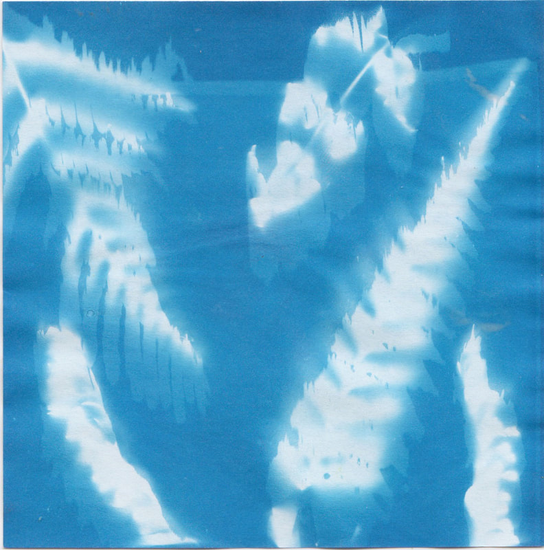
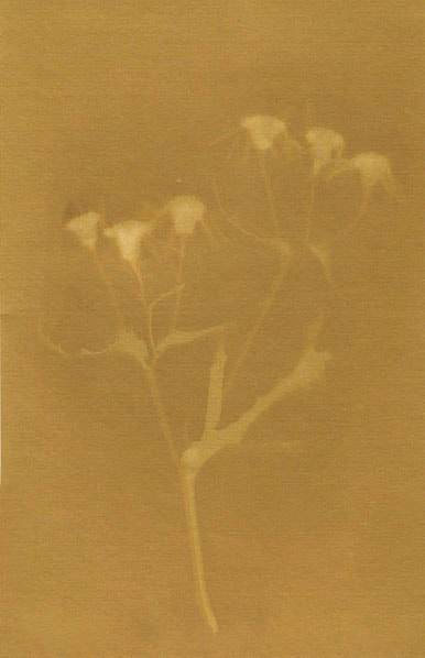
Cyanotypes
Cyanotypes are an 170 year old printing process, it is a slow reacting economical photographic printing formulation sensitive to a limited near UV and blue light. No darkroom is needed, instead they use the power of the sun and iron salt solutions rather than the silver salt solution of black and white photography. Ferric ammonium citrate and potassium ferricyanide are combined, and exposure to UV light creates ferric ferrocyanide.
Artist inspiration - Anna Atkins

|

|

|
First attempt
|
|
For my first attempt I bought some already dyed cyanotype paper online. During the time of attempting these it was not very sunny so i had to act quickly if there was any direct sunlight. I decided to use any plants i could that i thought had a nice shape or pattern to them so that it could show up on the paper. Lots of the plants didn't particularly work for example the shape that looks like a bell is a leaf. I ended up using parts of a fern more as this came out the best. Unfortunately the cyanotype kit i had bought wasn't very good quality and the paper was very small and thin. For my next attempt i am going to try dye my own paper using the chemicals and this appear will be a sort of card so much nicer quality. The photo at the end of the slideshow was my first first attempt at school. It was not sunny on this day so i used the UV box, sadly the light was not that strong so the image didn't come out as clear as i would have wanted.
|
|

|

|

|

|

|
Making my own
As a second attempt to cyanotypes i decided to create my own by buying the chemicals online and painting it into some much nicer quality paper. Below are my first attempts at this as it is very trial and error process and takes a while to get correct as it relies on the sun etc, the images below are the best ones from the ones a created. Sadly i only got two good ones, the others didn't work very well and i didn't like how they looked.

|

|
Photograms
As a development on from cyanotypes I decided to create some photograms using the images of flowers i took above using the light box. I got the images printed out onto acetate and used the dark room. I liked these images and using the darkroom, however the images themselves don't particularly capture the detail within the plant so i probably won't continue creating photograms. I want to continue looking at alternative ways of showing my images and the structure and details of plants.

|

|

|

|
Artist inspiration - Leendert Blok - silent beauties
Blok was an early proponent of colour photography and realism – and an influential figure in the botanical photography of the early 19th century – Blok became fascinated with the flowers cultivated in the nurseries of his hometown Lisse, near Amsterdam. I felt inspired by his vintage images and how the 'old' look seemed to enhance the flower and make it appear more eye catching

|

|

|
Photoshop response
|
|
As a development from photograms i wanted to continue looking at old photo processes. I liked the idea of taking some very nice photos of flowers and making them appear old by printing them out and then dying the paper. As a first response I decided to create my images using photoshop and fake film textures i found online. To do this i took some new photos of some tulips as i preferred what these looked like compared to my previous flower images. I then searched up film texture overlays and went through lots until i found some that i thought would work well. I then put these images into photoshop and copied the film image onto the flower image and pressed multiply. This allowed for the two images to blend together, i played around with the opacity and contrast. For my next development i will make my own 'film soup' and print out my images onto card ready to dye myself.
|
Edits

|

|

|

|
Experimenting with different ideas
After creating these 'fake' film soup images, i thought about other ways of enhancing these flower photos. I decided to use my cyanotype images from above and merge them with my tulip photos.

|

|

|

|
Making my own film soup
|
|
When creating physical versions of these I tested out different paper to have my images printed on and different thing to put on them. The last image of the rose I actually pre dyed the paper and printed the image onto that paper to try see if it would make the image of the flower stand out more. I liked how it turned out as the picture wasn't fully immersed in the dye. I want to continue with the idea of creating vintage looking images that appear to look old or use an old photographic process to get this same effect.
|
First attempt
|
10 mins
Contents of soup - 5 tea bags, Boiling water, washing up liquid 
|
1 hour
Contents of soup - 5 tea bags, boiling water, hand sanitizer 
|
1 hour 30 - coffee, washing up liquid

After creating my film soup images I still felt drawn to the idea of making vintage/old looking images while using an old process. I found some images on pinterest of Lumen prints, i had never heard of this process so looked into how they are made and as i liked how they looked so much i decided to attempt these as my final piece. I knew it was a bit risky doing this as i had never created a lumen print before so I did not know if it was going to work in the exam. So the day before I did a practice and it turned out well so i felt confident to give it a go in my actual exam. As the exam is stretched over three days i had plenty of time to try and experiment with different paper until i found one that worked the best and I would feel happy with calling my final piece.
Exam finals
Lumen prints
Artist inspiration - Krista Mccurdy

|

|

|
What is a lumen print?
A lumen print is a solar photogram, bit like a cyanotype, however for these prints you use expired photographic paper. the process is simple, all you do is choose which objects you would like to print and place it on the expired photographic paper in the composition that you like. You then place this in the sun or a UV box for about an hour. Once done take out and wash for 30 seconds then place in a hypo fixer, this makes the images last for longer and fixes everything in place, then wash again for longer to remove any excess fix chemicals. The colours vary depending on sun exposure and the type of paper you used, but you can scan the images and put them in photoshop to manipulate the colours, contrast, and brightness too whatever you want.
|
Originals
|
My exam response
When making my own I collected a bunch of different delicate flowers or leafs that i felt would turn out well using this process. I created all of my lumen prints during my timed exam. I preferred these prints compared to my previous cyanotypes as you get too see more of the detail and structural aspects, also when overlapped the plants create a pretty almost luminescence as if it is glowing. I also liked how they could end up being any colour. During the exam i experimented with different types of photographic paper as you don't know how each type of paper will respond to the process until it is done. I would leave all my prints for an hour to an hour 15 mins. During my experimentation i found that Ilford photographic paper worked best and created the pretty pink colouring after fixing and the blue colouring before fixing that can be seen below. As the fixing chemicals change the colouration i would take a picture of the print as soon as it was taken out of the UV box so i could get the before and after. After scanning in my images i used photoshop to enhance the colours and adjust the contrast and brightness so that they looked more refined. |
First attempts
|
After fix

|
Before fix

|

|

|
Trying different photographic paper
Kentmere photographic paper

|


|
Film paper

|

|

|

|
Ilford photographic paper finals
After establishing what happens to several different paper I chose to create my final pieces using Illford photographic paper as it created the nicest colours. I captured images of the both the before and after fix and scanned them in to my computer to edit. I did not adjust much to the images I only played around with the brightness, contrast and colour balance although the colour is very much the same as the original physical copies.
Overall
Overall I am happy with my final pieces and believe that they capture my intention that i had throughout the entirety of my project. I used an old photographic process to capture a magnified image of delicate and pretty flowers.
|
After fix

|
Before fix

|

|

|

|

|