Exhibition - Cornelia Parker
|
|
During the summer i visited the Cornelia Parker exhibition at the Tate Britain. Cornelia Parker is a British artist best known for her sculpture and installation works, she also works with drawing, photography, printmaking and most recently embroidery. I found this exhibition very interesting and I liked the use of shadows in many of her large scale installations. For example the first photo in the slideshow is of a her work called 'Cold Dark Matter : An exploded view' , this piece is the restored contents of a garden shed that Cornelia Parker requested the British Army to explode for her. The remaining pieces are hung from the ceiling ,as if caught mid explosion, lit by a single lightbulb that casts big dramatic shadows across the room. I really liked looking at all the little pieces from the shed like children's toys to tools, there was a massive variation of things from it.
Another installation of hers that cast very nice shadows is 'Perpetual Canon' . I liked the concept behind this piece as well "Perpetual Canon is a musical term that means repeating a phrase over and over again. The old instruments had experienced thousands of breaths circulating through them in their lifetime. They had their last breath squeezed out of them when they were squashed flat. Suspended pointing upwards around a central light bulb, their shadows march around the walls. This shadow performance replaces the cacophonous sound of their flattened hosts. Viewers and their shadows stand in for the absent players." - Cornelia Parker |
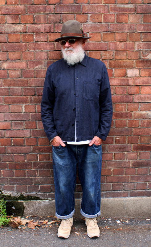
Identity
Identity in fashion
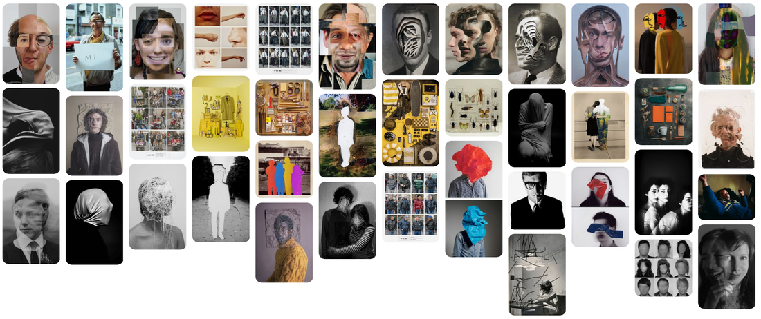
Exactitudes : collective
Photographer Ari Versluis and stylist Ellie Uyttenbroek have long started Exactitudes, a project that, put it simply, is a striking visual record of more than three thousand neatly differentiated social types the artists have documented over the last twenty years. Both inspired by a shared interest in the striking dress codes of various social groups, they have systematically documented numerous identities over the last 21 years.
Their photos work extremely well as they get all the participants to pose in the exact same way in front of the neutral background creating an isolated image of the person.
Their photos work extremely well as they get all the participants to pose in the exact same way in front of the neutral background creating an isolated image of the person.
|
|
|
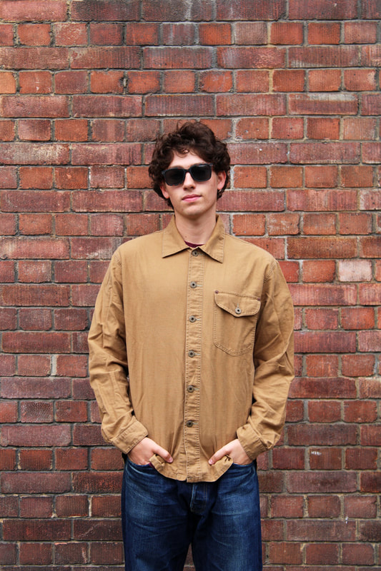
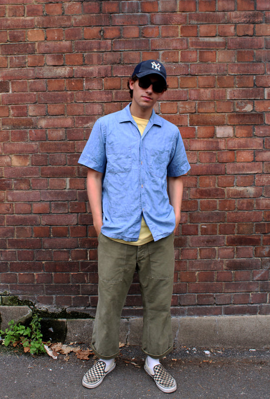
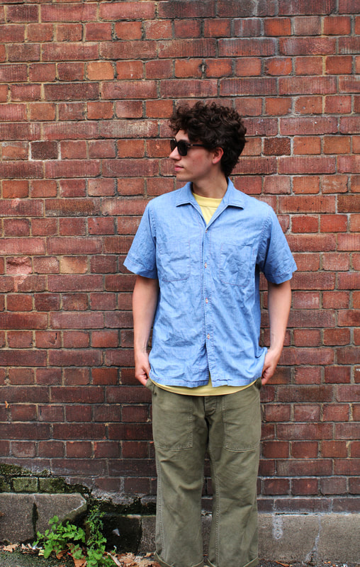
First Response
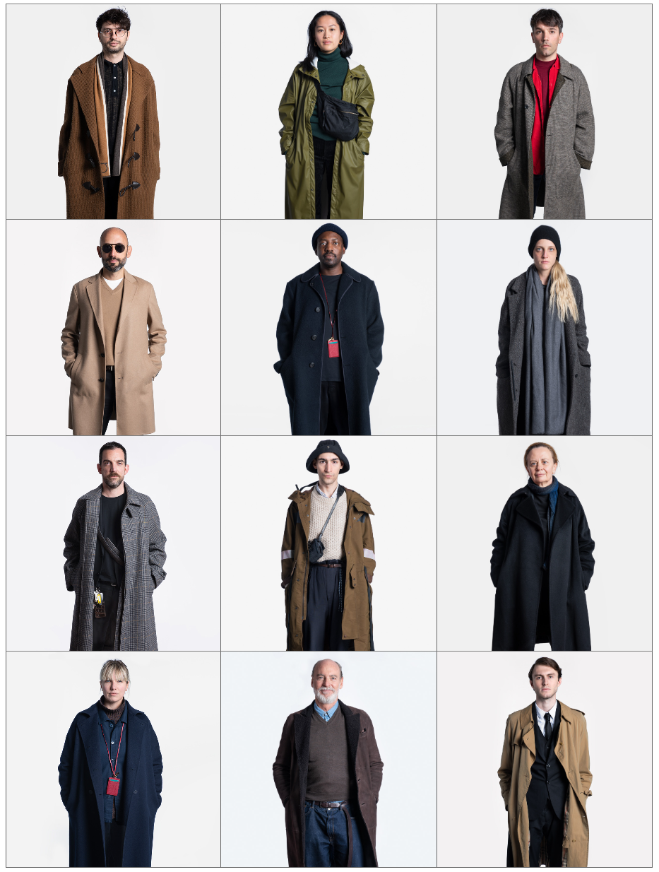
In my response inspired by the exactitude photos i chose to photograph my poppa, brother, and dad as they all have the same inspired dress sense. My dad took inspiration from my poppa and my brother took inspiration from them both. All three of them shop in all the same clothes shops and love fashion and their clothes (a lot) , they all take a lot of pride in how they dress and look. The way they dress is part of them and their identity's and adds to who they are as people.

|

|

|
|

|

|
Zach

|

|
|
|

|
|
The past & the present

Old vs Modern architecture
My response
Shadows

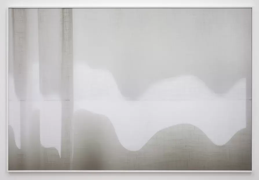
Uta Barth
Uta Barth is a Contemporary photographer, and was born in Berlin, Germany. Uta Barth takes a simple observation - like sunlight flickering through a curtain - and turns it into a complex perceptual experience. The left and right images below are from her work called ' To draw a bright white line with light..' this sequence of photographs follows a wavering band of light as it slowly winds its way across the curtains of Barths home in one single afternoon.

|

|
|
My response
For my response over the summer i took photos inspired by Uta Barth when i saw the opportunity too, as you can see 3 lots of them were taken at different times and in different places. I think the most effective photos are the last 3 images as they resemble Barths work the best, i like how you can see the different lines from the windows mixed with the sunlight. When editing my images i increased the brightness a bit to give that same blurred effect that some of Barths images have, almost like they are out of focused.

|

|

|

|

|


|


|

|
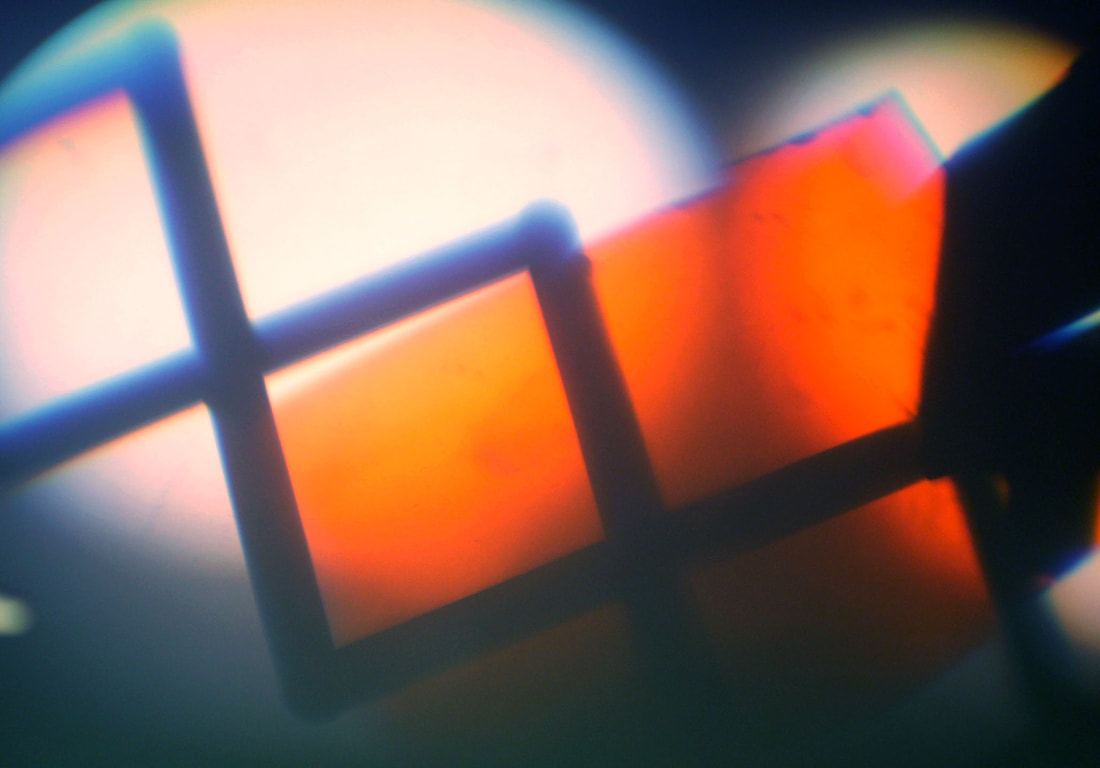
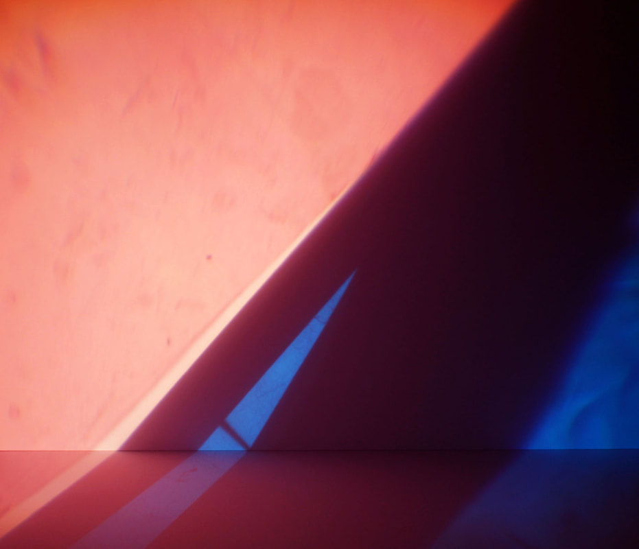
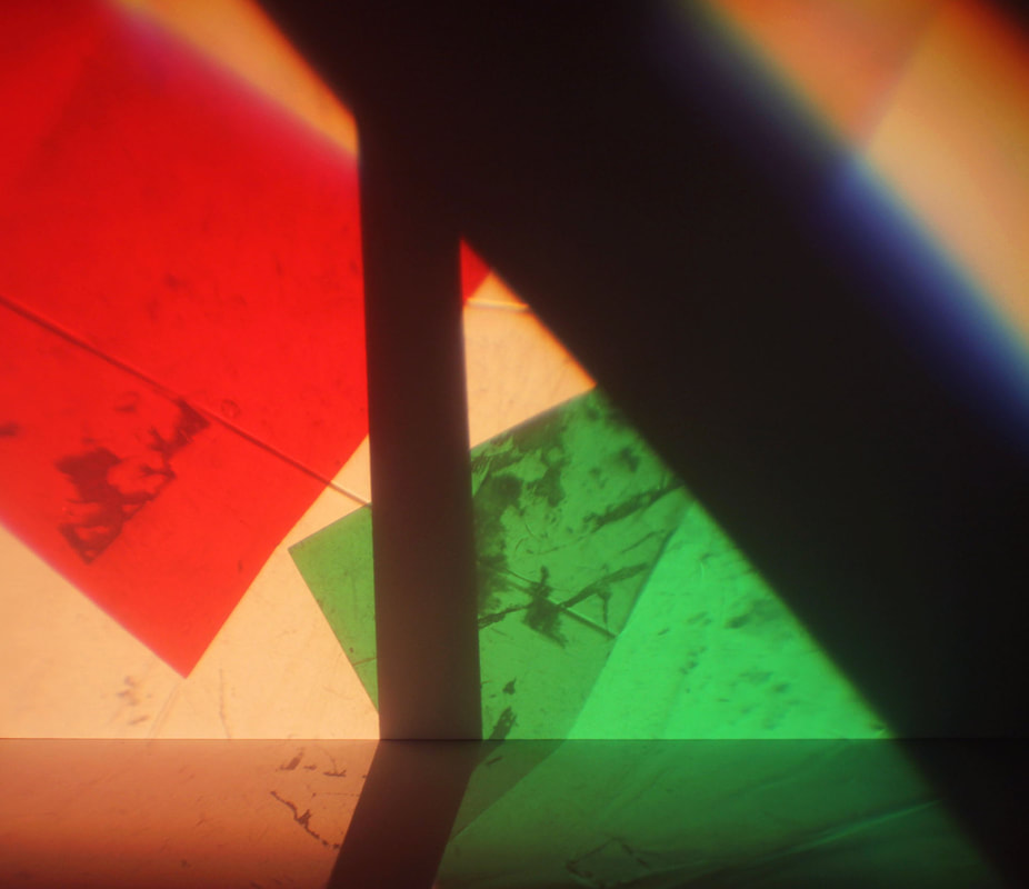
Experimenting with shadows
I decided to further my look at shadows and experiment with colour and shadows. I did this by using a bright light beaming onto a white piece of paper and held objects up in front of it to create different shadow shapes, i then held colour gels up to be the background of the shadows created.

|
|
|
|

|

Chosen Word - Shadows
After evaluating my two words above I decided to further develop the work 'Shadows' making it the key word in this project. I felt i could explore this title in further detail, and look at areas i had not yet done.
Solve Sundsbo
Solve Subsbo is a Norwegian fashion photographer, his work includes everything from X-rays and 3D scanning to hi-tech manipulation and lengthy hand painted retouching. Subsbos' work looks as though it has been digitally altered but in fact it has not, Subsbo uses old fashioned techniques including hand painted film, shadow and light, and intricate detail to styling and the composition. I find Subsbos work extremely intriguing as he reflects different shadows and light but also manages too make his images look black and white when they are actually not, this creates a very nice contrast.
Within his work he typically takes his images close up to the models body and face, he has then reflected shadows and light onto the model to create different patters all over her. He manages to create a monochrome look by using black and white patterns but also highlights this further by using makeup on the model to create a deeper contrast, as you can see below the model has white body paint on and a sleek dark haircut.
Within his work he typically takes his images close up to the models body and face, he has then reflected shadows and light onto the model to create different patters all over her. He manages to create a monochrome look by using black and white patterns but also highlights this further by using makeup on the model to create a deeper contrast, as you can see below the model has white body paint on and a sleek dark haircut.

|

|

|
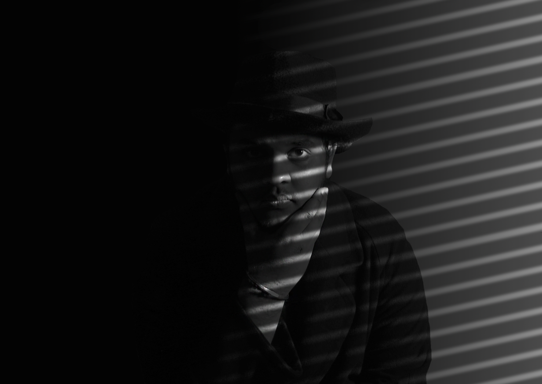
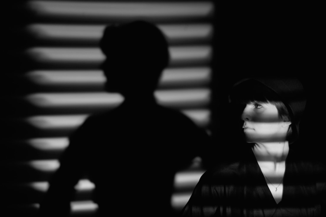
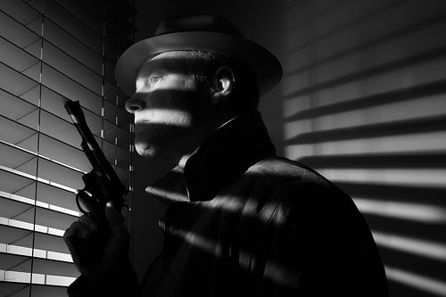
Link to Film Noir
Film Noir is a cinematic term typically used to describe stylish Hollywood crime dramas, the 1940s and 1950s are generally regarded as the 'classic period' of American film noir. Associated with its low-key, black and white visual style with harsh shadows and silhouettes much like in sundsbos' work
|
|
|
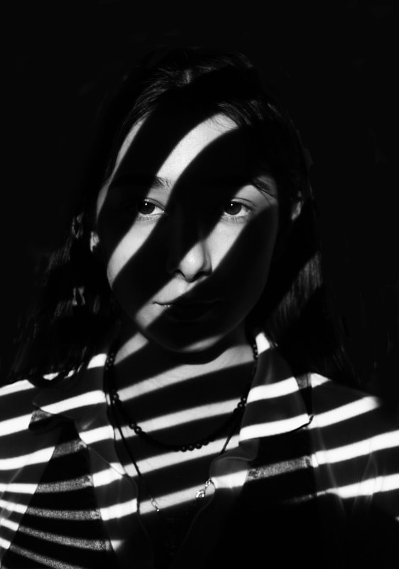
My response
For my response I got my model to pose in front of the white board projector at my school and projected an image of black and white stripes that i found online onto her face. I then told her to pose in different ways and i played around with zooming in and out to capture different compositions.
I then went into Photoshop and made my images black and white, because they didn't have the same effect that Sundsbos' images have. I played around with the contrast and brightness too try get that same harsh monochrome look. I then edited the background so that it was all black and so you couldn't see that white board behind that also had the image on. I feel this makes the images look more clean and allows for the stripes on the face too really stand out. Below are the best edited versions from the shoot. Im pleased with how the images turned out, however they don't have the same intense contrast black and white that Sundsbos' work has and aren't as refined and polished as i would have liked.
I then went into Photoshop and made my images black and white, because they didn't have the same effect that Sundsbos' images have. I played around with the contrast and brightness too try get that same harsh monochrome look. I then edited the background so that it was all black and so you couldn't see that white board behind that also had the image on. I feel this makes the images look more clean and allows for the stripes on the face too really stand out. Below are the best edited versions from the shoot. Im pleased with how the images turned out, however they don't have the same intense contrast black and white that Sundsbos' work has and aren't as refined and polished as i would have liked.
|

|
|
Before editing

|
After editing

|
Further development
Mads Perch
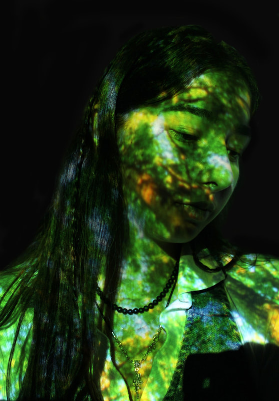
I then began looking at the work of Danish born photographer Mads Perch, he is London based and has established himself as a fashion/music photographer. His work can be perceived as a romanticised appraisals of constant technological advancement due to what he uses to create his pieces. The collection of work from Perch I decided to look at was a series of images of models having colourful, experimental, abstract prints projected onto their faces. The images appear futuristic and all the subjects appear to be caught in a sublime state somewhere in between reality and virtuality. He uses colour and shadows to enhance his models, as well as using grid projections, smoke/dust forms, and light rays to create these futuristic, stunning, images.
His work is similar too Sundsbos' in the way that patterns are projected onto the models but Perch incorporates colour and a different use of patterns to create his images, they appear futuristic and all the subjects appear to be caught in a sumlime state somewhere between in between reality and virtuality .
His work is similar too Sundsbos' in the way that patterns are projected onto the models but Perch incorporates colour and a different use of patterns to create his images, they appear futuristic and all the subjects appear to be caught in a sumlime state somewhere between in between reality and virtuality .
|
|
|
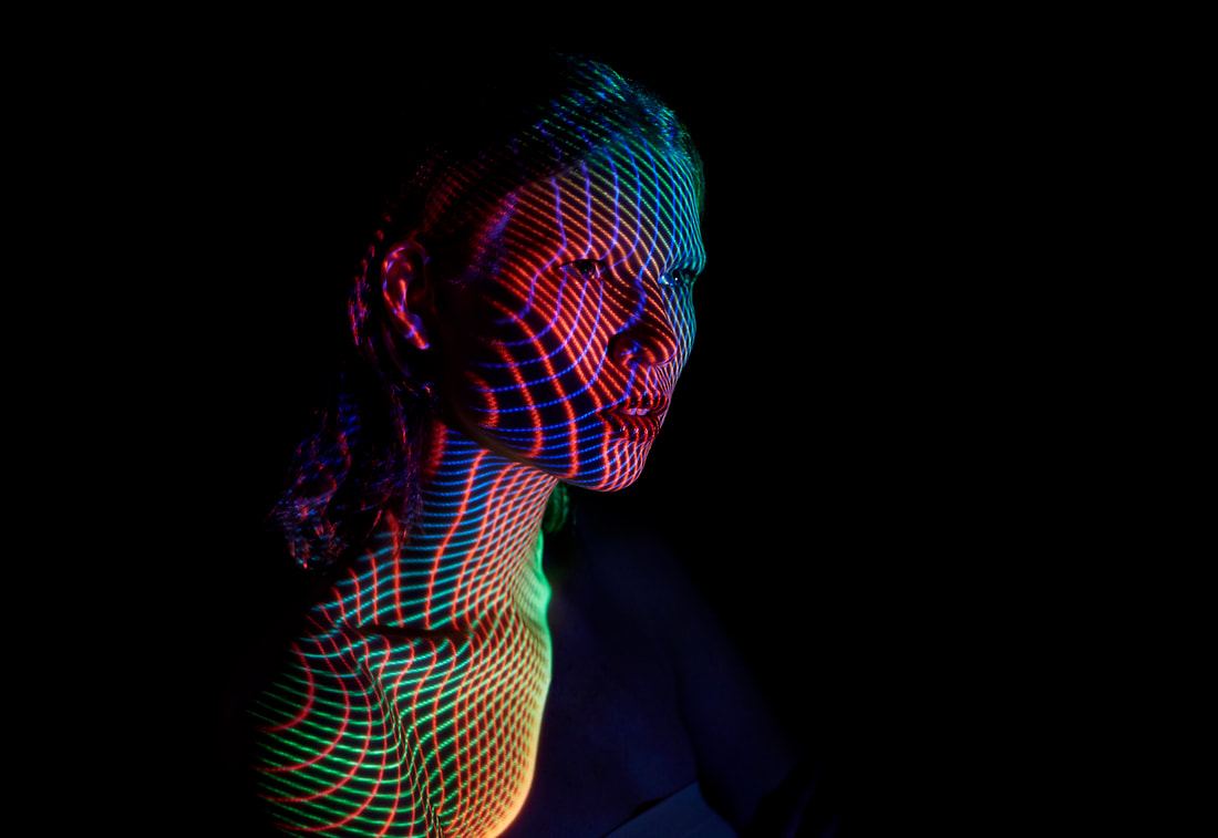
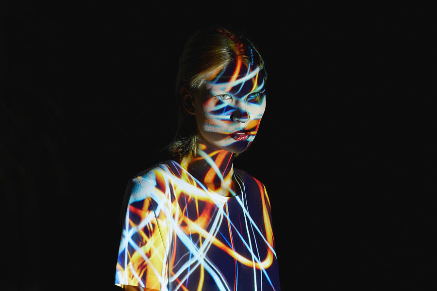
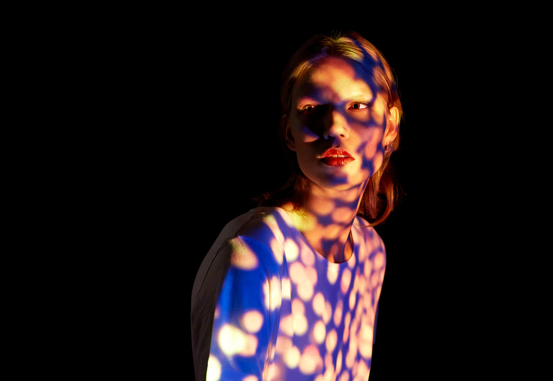
My response
When taking my images I got my model to stand in front of the school whiteboard, I used images I thought resembled the same electronic, futuristic feel that Perch’s images have. I used images of fireworks, tree canopy ect. I got my model to pose in different ways and only once got her to look directly down at the camera to get the same ‘caught in a sublime state’ that Perch’s work has. When it came to editing my images on photoshop I needed to black out the background to get full focus on the image being projected onto my model, however I also liked how certain images looked without blacked out backgrounds so i kept some unedited in this way.
To improve this I would use my own images, i did just take images of the internet which ruins the feel of the image as they feel quite like a stock photo and are not ambitious enough, they also don't have the same robotic futuristic look that Perch's work has.
To improve this I would use my own images, i did just take images of the internet which ruins the feel of the image as they feel quite like a stock photo and are not ambitious enough, they also don't have the same robotic futuristic look that Perch's work has.

|

|

|

|
Further edited


How i edited the images - To make the black background i used the brush tool and carefully went around the model.
|

|
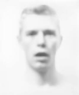
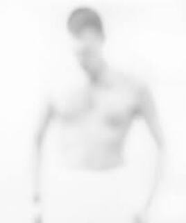
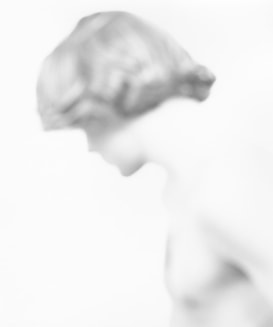
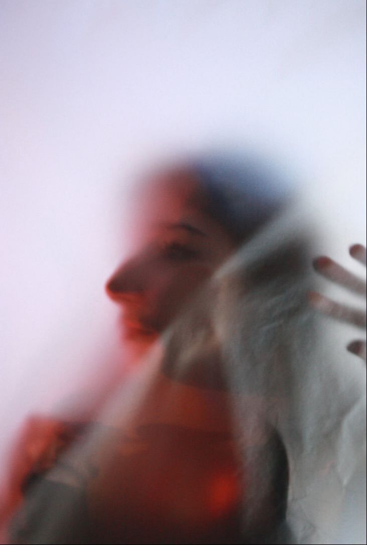
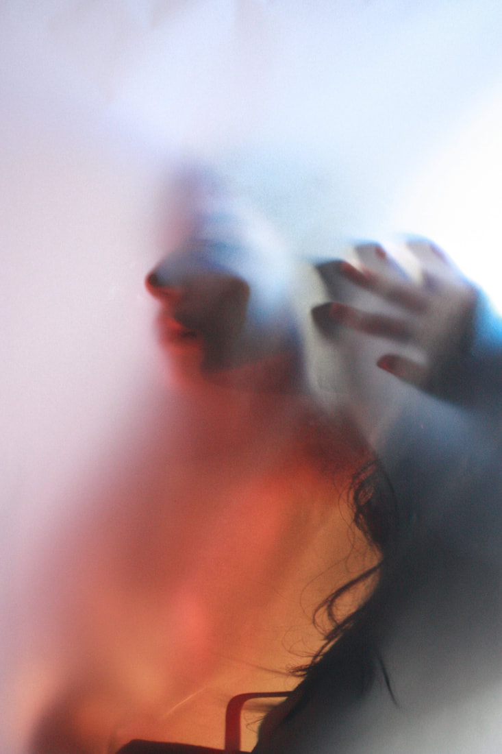
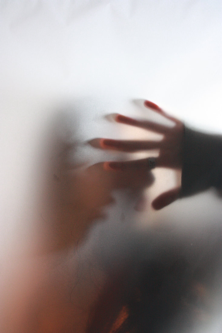
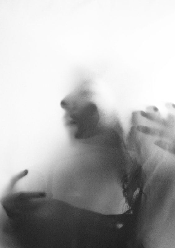
Bill Jacobson
Bill Jacobson is an American photographer who focused on portraitures in 1989. Jacobsons project 'Interim portraits' focused on pale, shadowy, out of focus portraits of figures. These images focus on fleeting memories and inner states rather than clear representation and recognition . 'Interim portraits' features these pale shadowy figures to evoke the loss experienced by many during the height of the AIDS epidemic. The blurred subjects underline the futility of capturing a true human likeness in both portraiture and memory.
|
|
|
My response
Within the projection work i did i liked how the the models was distorted slightly by the image being projected onto her, I found the work of Bill Jacobson who completely distorts his models by blurring them. To help him achieve this he uses harsh lighting to drown out anything else within the image.
For my response to his work I used tracing paper to create the same blurred effect like in Jacobson's work. I got my model to stand behind the paper and put her face up against it. However for my response I decided to use some gels over the light that was shining behind the models head. I found the colour added a different effect to the images, and added to shadows being created. Although I did change two of my favourite images from the shoot into black and white to resemble Jacobson's work.
For my response to his work I used tracing paper to create the same blurred effect like in Jacobson's work. I got my model to stand behind the paper and put her face up against it. However for my response I decided to use some gels over the light that was shining behind the models head. I found the colour added a different effect to the images, and added to shadows being created. Although I did change two of my favourite images from the shoot into black and white to resemble Jacobson's work.

|

|
|
|
|
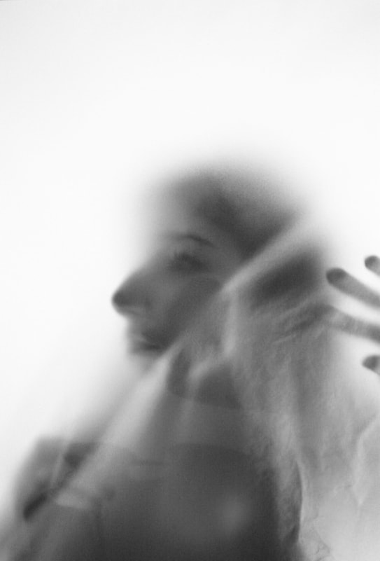
Black and White edits
|
|
A different approach
I decided that i wanted to move away from using people, and focus back on my first initial work on Uta Barth. She creates beautiful images of boring mundane experiences and i wanted to figure out alternate ways of doing this. Upon research of different photographers I found Coppi Barbieri who use objects instead to achieve the same ordinary to extraordinary feel that Barths work has.
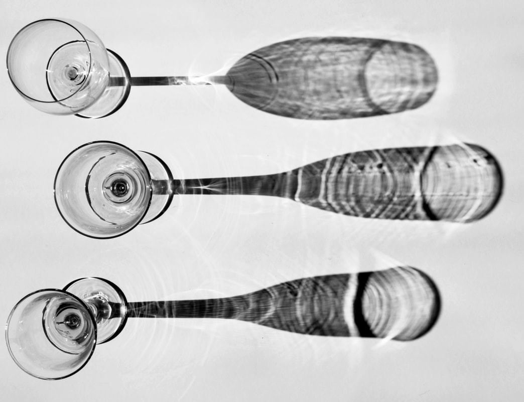
Coppi barbieri
Coppi Barbieri are a photography duo made up of Lucilla Barbieri and Fabrizio Coppi who met in the 80s, the pair have since grown to become some of the respected commercial still-life and interior photographers. Before their commercial career took of the two would experiment with photographing flowers submerged in water, and household items such as plastic bottles and glassware.
Below are some of their glassware work, i find this work very intriguing and interesting too look at. The high contrast shadows are effective at making the image feel quite abstract and you are almost unaware of what is making the shadows.
Below are some of their glassware work, i find this work very intriguing and interesting too look at. The high contrast shadows are effective at making the image feel quite abstract and you are almost unaware of what is making the shadows.

|

|

|
My response
For my response i used a white piece of paper and a few different glasses. Originally I thought I would be able to create the shadows artificially using a torch or phone light, however I found that the shadows created this way were not as effective or strong as i would like them to be. This led me too place the card in a spot where sunlight was coming into my house, i had to sit and wait to capture as many photos as possible before the sun disappeared for a bit. Although it was worth it as I am very happy with how my images turned out. Once taking as many photos as possible i went into photoshop and edited my favourite images, I first changed them into black and white and then began to play around with the contrast and levels. I increased the contrast quite a lot of create the intensity that Coppi Barbieri's images have.
I also took a few images using coloured glasses, these are not as effective as the black and white images but i really like them anyway. I like how it almost looks like they are floating mid air.
I also took a few images using coloured glasses, these are not as effective as the black and white images but i really like them anyway. I like how it almost looks like they are floating mid air.
Contact sheet for this shoot

Best Edits

|

|

|

|
Using colours
|

|
Second response to Coppi Barbieri - colours and glass

|

|

|
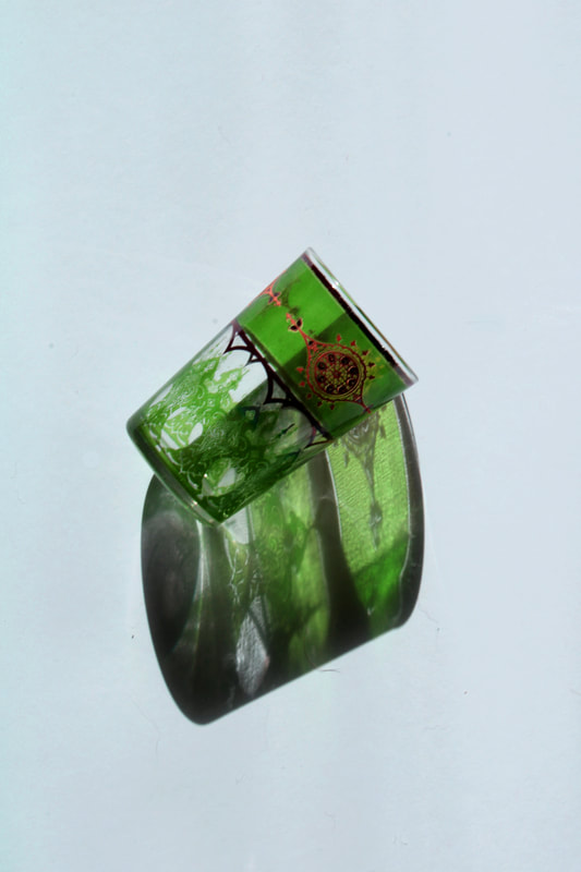
Experimenting with glass shadows on faces:
As a mini development/experiment I thought I would put everything together and try using the reflection of a glass projected onto someone's face. I shined my phone torch through a green bottle, which created a very nice green shadow across the models face. I got her to lay on the floor as stood up the light wasn't as powerful or effective, I also like the shadow is reflected onto the floor. I wanted experiment with creating a giff, to do this i decided to take a few images all together while moving the the glass and light and captured how the light moved, i like how it almost looks like water going over her face. However I would like to create more clean and perfected versions of these using different glass and colours perhaps.

|

|

|
Development 2
Contact sheet for this shoot


I decided to continue with the idea of adding all the elements together, and expanding on the idea of giffs. I decided to use a different approach by using her hand to create the shadow. I used the same technique however instead of shining my phone torch through a coloured object, this time, i used colour gels placed over my phone torch. I used multiple colours to add more effect to the moving shadow. Beside are the most effective giffs I produced, the other images came out slightly blurred, I like all the different colours and how they blend with the hand. I prefer the first one as you cannot see her hand in frame making it appear more clean and effective. |

|
Gif development
As a further development on making Giffs i took a series of images using glass bottles and glasses and a overhead torch. To do this i placed the glass object i wanted to use and moved the light to move the shape, size, and position of the shadow.


|

|

|

|
Below are some images from the same shoot that i decided to edit in photoshop for some experimentation. I decided to play around with the colour and saturation too see if this would add anything to the reflected glass. I like how these turned out and i want to continue to use more colour in my images and see what different shadows can be made with different colourful objects.

|

|

|
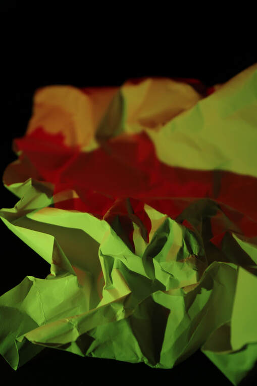
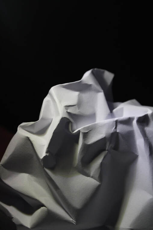
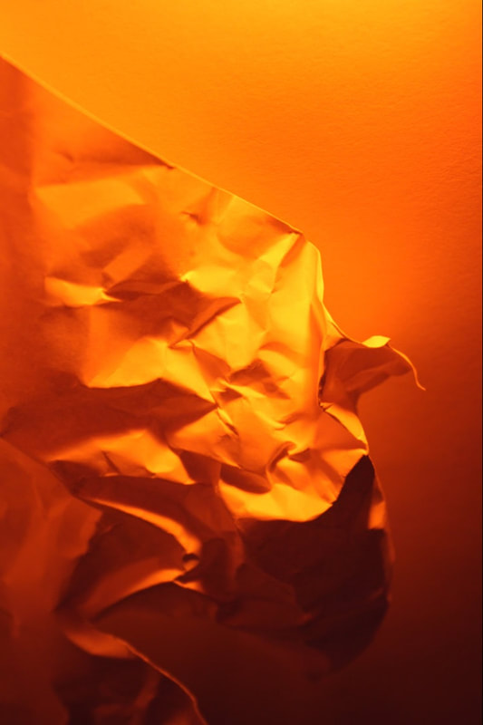
Using paper - experimentation
As an experimentation i decided to use a piece of paper and use light to highlight the folds in it. I decided to crumple up the paper which allowed for lots of spaces that the light could bounce onto. Instead of focusing on the shadows that are released off of glass and wanted to focus on just abstracting the structure of an object simply by a variety of shadows. I used two light sources for some photos and others i chose to just use a torch leaving the paper white, contrasting with the black background.
|
|
|
|
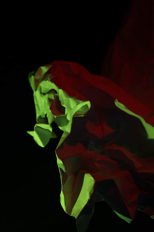
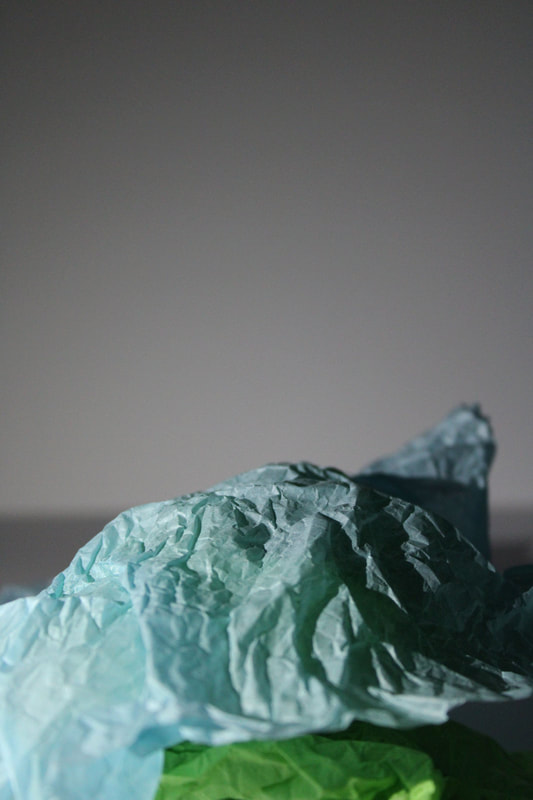
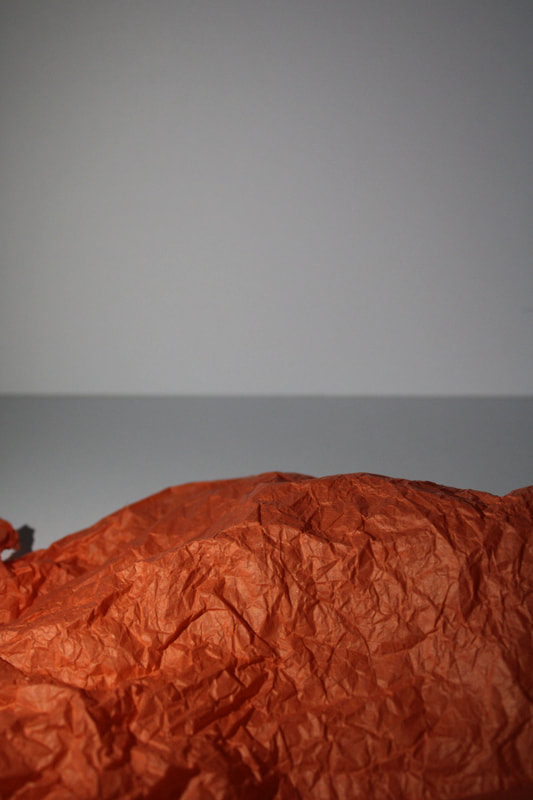
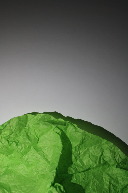
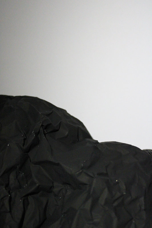
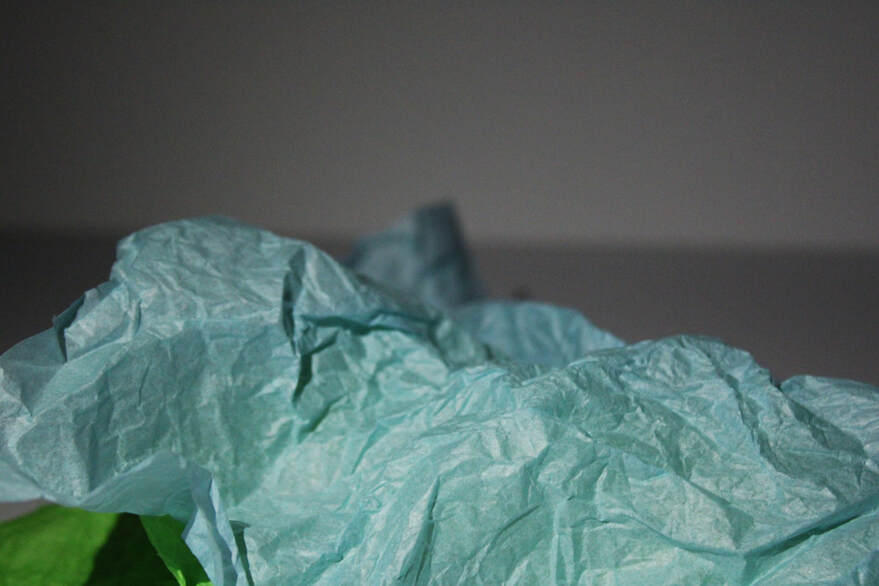
Second response
As a second response I decided to use a different type of material/paper to fully see the different effects. I decided to use tissue paper, this created many more creases and folds in it after being crumpled up. I shot from an angle that attempted to make the tissue paper look like a mountain and allowed for lots of negative space above. The shadows created add to the mountain effect, almost like an illusion.
|
|
|
|
Development 2 of using objects to create shadow
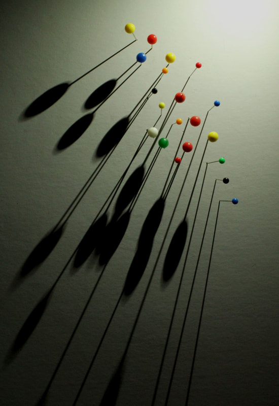
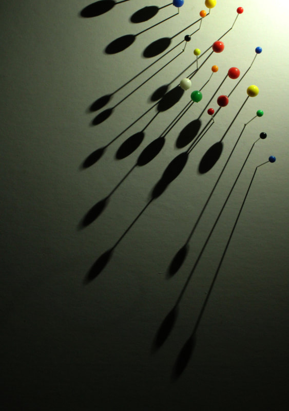
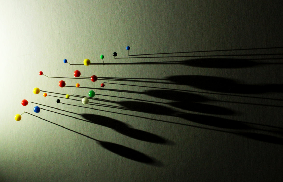
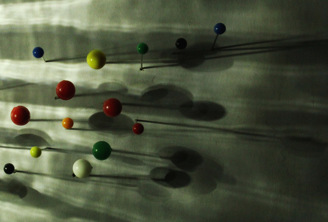
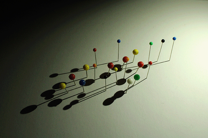
Robin Broadbent
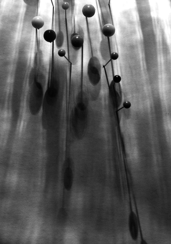
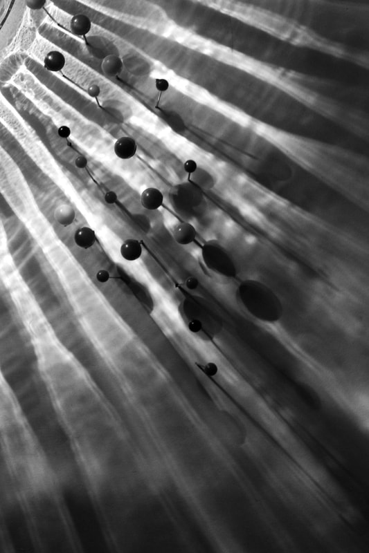
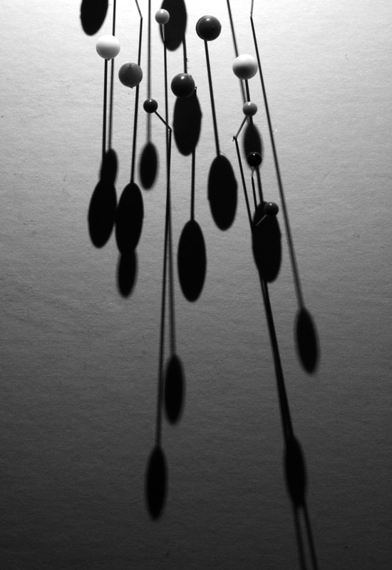
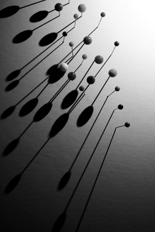
Below are images by artist Robin Broadbent I found on Pinterest (linked). They were my ultimate inspiration for this development, I really liked how the simple use of sunflower seeds or coffee beans creates powerful shadows. I decided after using glass for a while that i wanted to move forward and choose a different object that could achieve the same powerful effect that the glass has. Broardbent's work does this by using a large amount of small objects to create multiple strong shadows that enhance the basic look of the basic object being used.
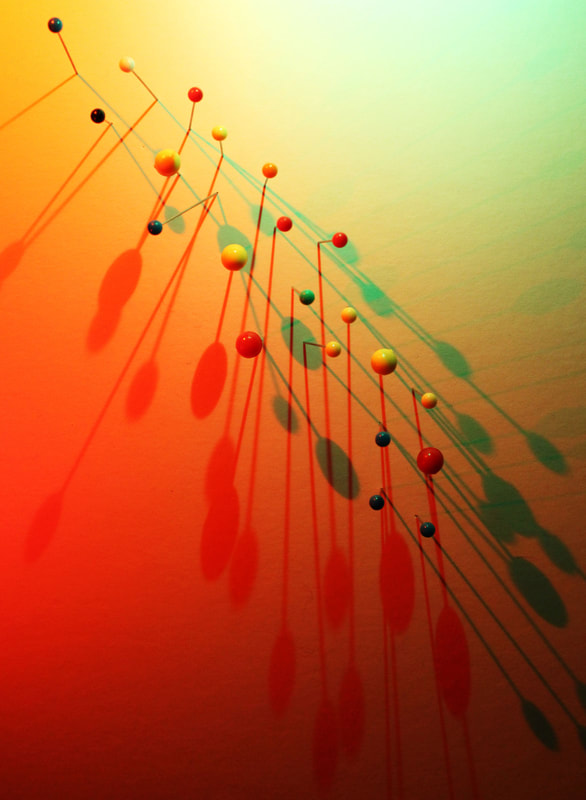
When shooting my development i decided to use drawing pins as my object. I like how these create an interesting shape and almost look like planets, or people shooting across a sky.
When shooting my development i decided to use drawing pins as my object. I like how these create an interesting shape and almost look like planets, or people shooting across a sky.

|

|

|
Contact sheet for this shoot


My work
|

|

|

|
|
|
|
Black & White edits
|
|
|
|
Development 2 - Using two different light sources
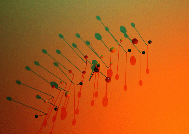
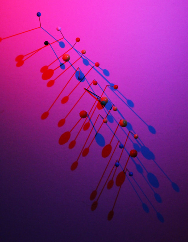
Developing on from the idea of using pins, I decided to return to the idea of using two different coloured light sources to create two different shadows. I still like the idea of the giff and having the multiple shadows moving, i also like how in the images all the different colours blend together to create a nice gradient of the colours.

|
|
|
|

|
Andre Kertesz - Form over Function
Development 3

|
|

|
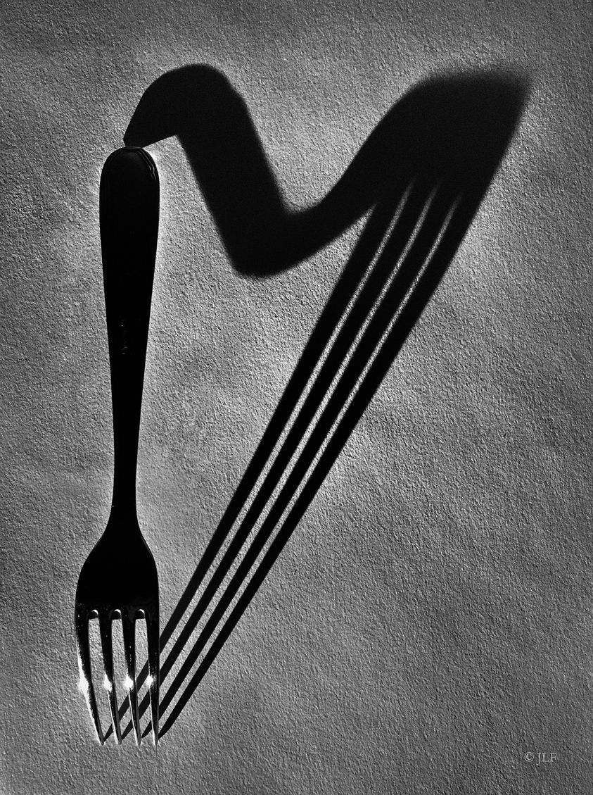
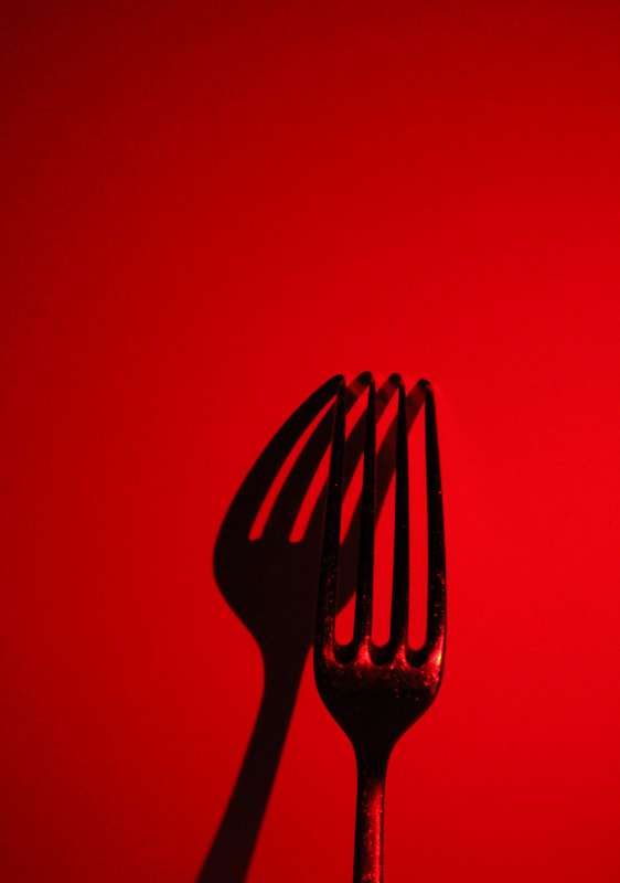
Continuing on from my images of the pins as a mini development I decided too look at the shadow work by Andre Kertesz.
I was particularly drawn to the idea of pattern and similarity and using simple everyday objects to create grand shadows. I decided to take inspiration from his work using forks and everyday objects. I wanted to still play around with the use of colour and different colours - drawing on my previous work. I decided to make these into giffs linking to a previous development using multiple colours moving in a giff. Im pleased with how these turned out and i want to continue the idea of colour. |

|
|
Second response to Kertesz
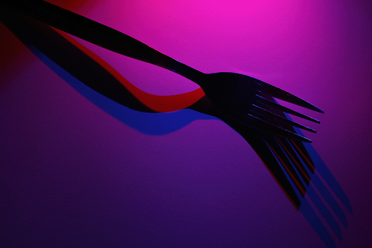
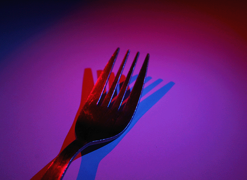
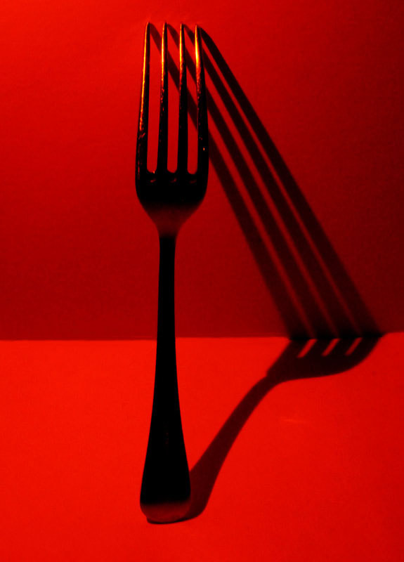
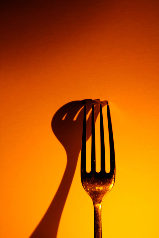
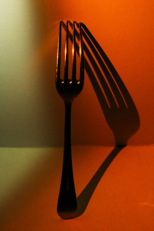
As a second response to Andre Kertesz i continued using the forks to create shadows and the use of coloured lights. Instead of giffs i did individual photos playing around with the different shapes the fork could make while the coloured light created a nice background. I especially like the first image, the contrast between the red and the shadow go well together. The fork itself appears to look as well tricking the eye slightly.
|

|
|
|
|

|
Development 4
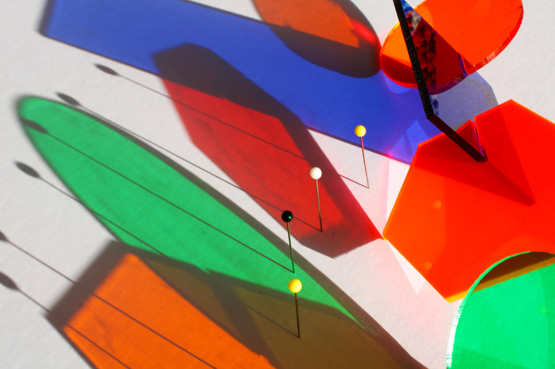
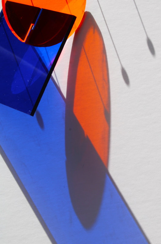
Laszlo Moholy-Nagy
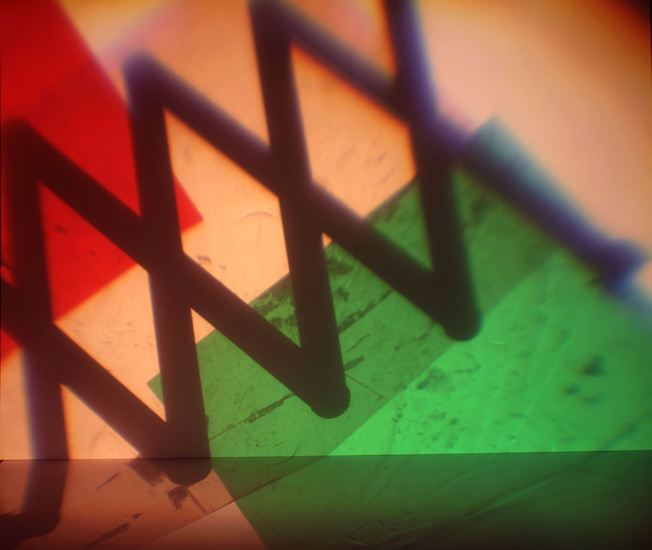
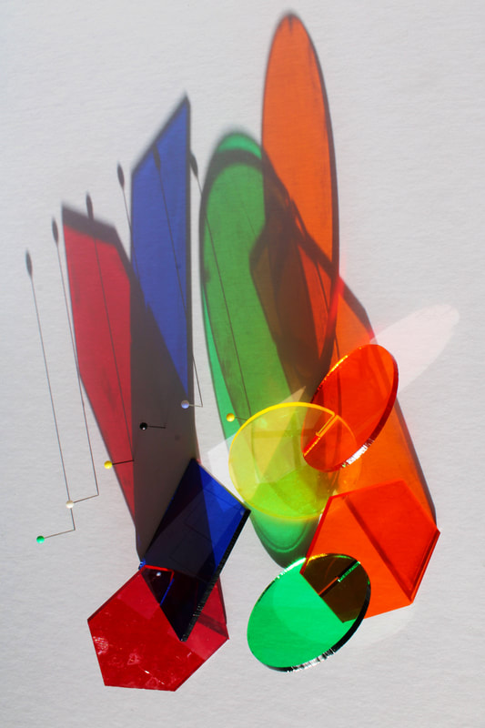
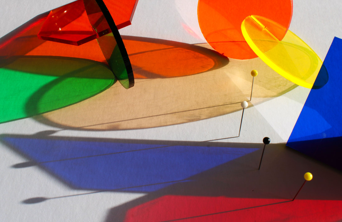
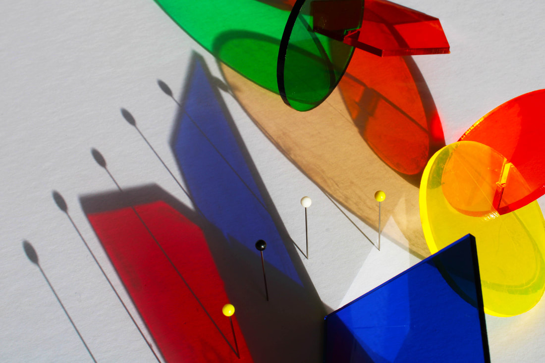
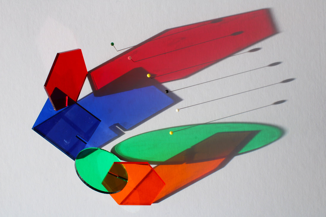
As a further development I looked at some images by the artist Laszlo Moholy-Nagy. I wanted to tie in the use of the pins from the previous development but this time incorporate more colour and colourful shadows. To do this I used coloured plastic cut out into different shapes that had little slits in then so that i could fit them together, like a puzzle. I took inspiration from both the pictures below. I wanted to use natural sunlight instead of artificial light as it created a more bright photo and made the colours stand out far more, so i placed the plastic shapes onto a white piece of card and waited for sunlight to shine onto them.
I am pleased with how this development turned out and i like how the shadow of the pins add to the other colourful contrasting shadows. When taking the images I played around with what colours worked best and where they should be positioned.
As a next development i want to continue using the coloured plastic but in a different way.

|

|
My work
Contact sheets for this work


|

|
|
|
|
|
|
|
Zoomed in edits - focusing on the shadows more

|

|
|
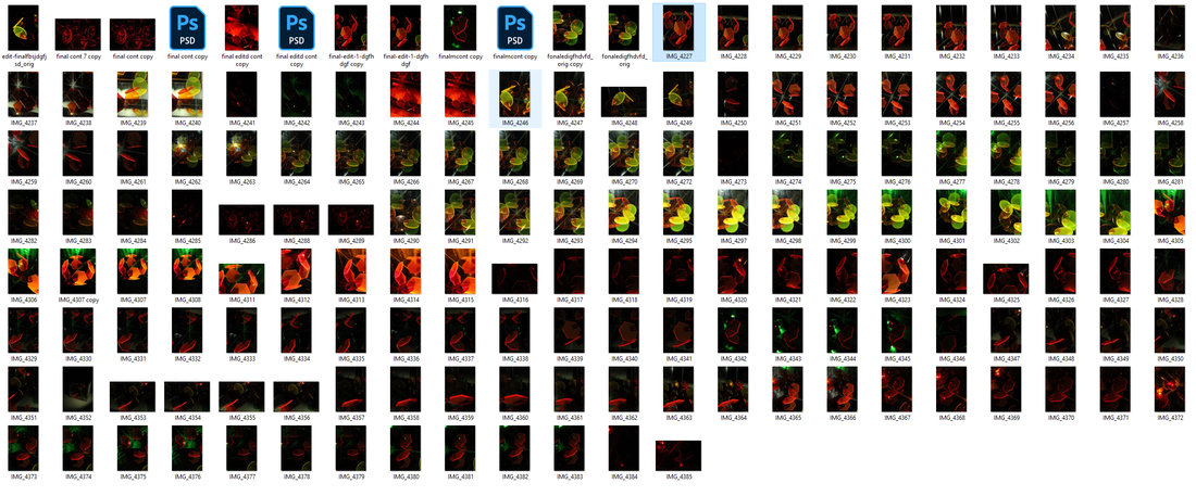
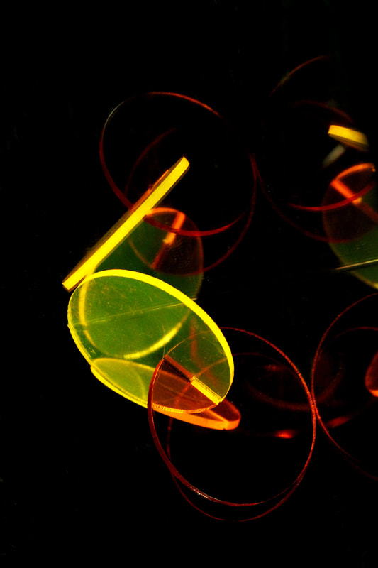
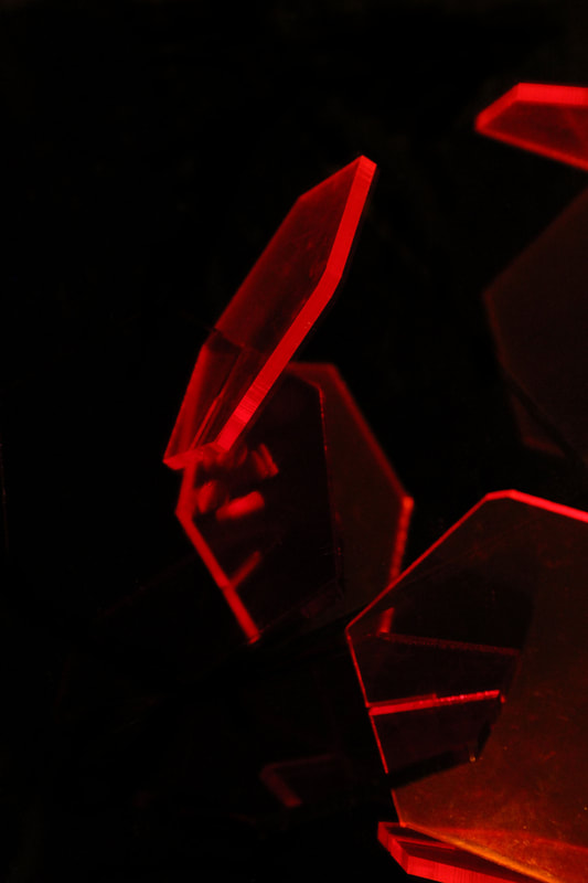
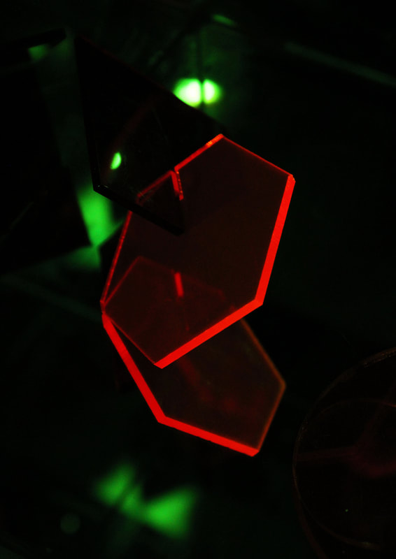
Final Piece Development
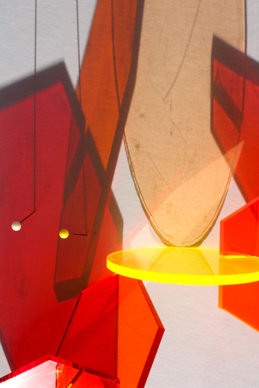
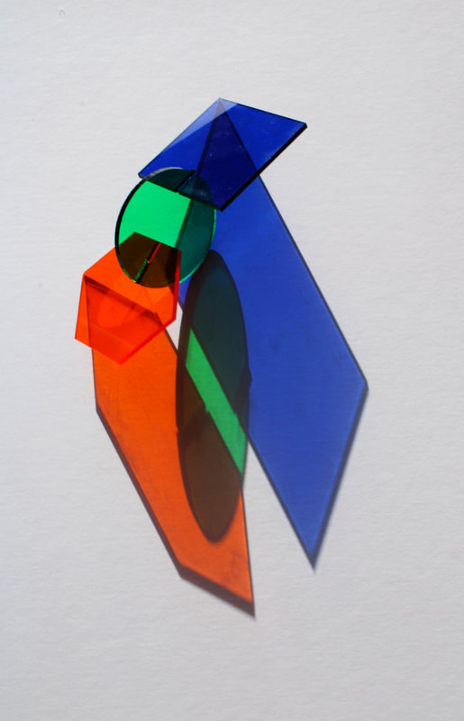
Barbara Kasten
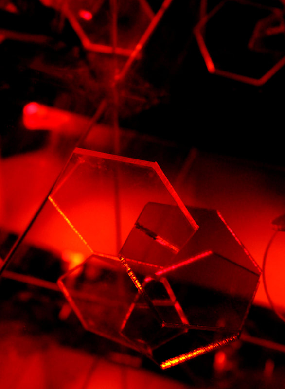
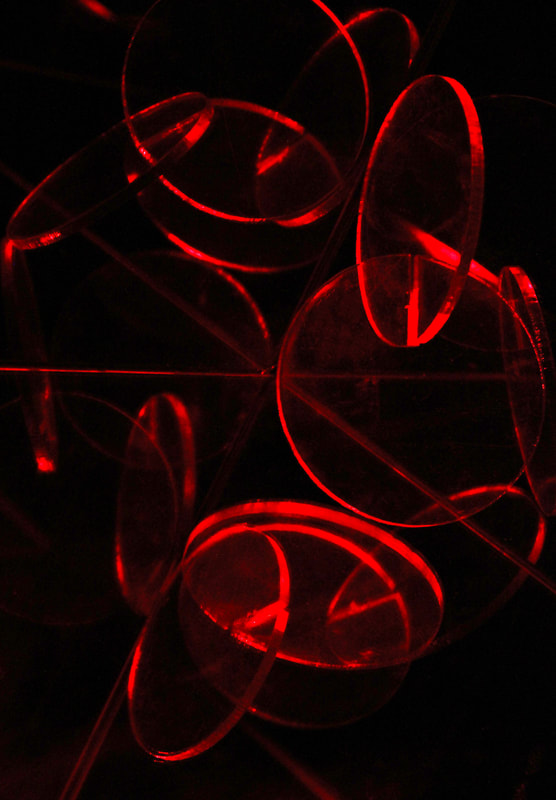
Barbara Kasten is an American artist who uses colourful acrylic cut into different shapes and creates projections of them. She uses mirrors, coloured gels, and lights to create abstracted reflections/projections. I like how the acrylic appears to be floating in mid air, I wanted to create this look in my work.
In my work I wanted to take inspiration from her by using reflections from a mirror. I continued to use the plastic coloured shapes from my previous work to do this, I also used a mirror box which was vey helpful. However when taking the images i realised how the reflections/ 'shadows' weren't as prominent as I would've liked, because i was shining my phone torch light over them it drowned out some of the colour - it also reflected on the glass and plastic which I didn't really like which you can see in the second photo on the left. To solve this i decided when editing to black out the background, this highlights the reflections more and makes the photo more ambiguous as you can't even tell that these shapes are inside the mirror box.
In my work I wanted to take inspiration from her by using reflections from a mirror. I continued to use the plastic coloured shapes from my previous work to do this, I also used a mirror box which was vey helpful. However when taking the images i realised how the reflections/ 'shadows' weren't as prominent as I would've liked, because i was shining my phone torch light over them it drowned out some of the colour - it also reflected on the glass and plastic which I didn't really like which you can see in the second photo on the left. To solve this i decided when editing to black out the background, this highlights the reflections more and makes the photo more ambiguous as you can't even tell that these shapes are inside the mirror box.

|

|

|
My work
|
My setup

|
Contact sheet
|

|
|

|
|

|
|

Final piece
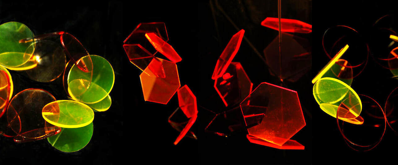
For my final piece I decided to continue using the mirror box and the plastic shapes to create different 'shadows'. I wanted to incorporate the use of different colours still, I used the images from my development and decided to place them in a strip as if it was one big photo and they were all side by side. I did this by making sure the images I chose were not only my best ones but had a black background so that it all flowed and merged nicely together.
Overall my favourite is No.1, I like how all the colours flow together and it uses elements of the double colours that I have previously used. I really like how the reflections or 'shadows' make it look like there is double of everything and you are unsure whether the objects are floating or not adding to the abstract feeling. For the 3rd image it became more like a collage as i stacked different images on top of each other and edited them to sit in front or behind one another.
Overall my favourite is No.1, I like how all the colours flow together and it uses elements of the double colours that I have previously used. I really like how the reflections or 'shadows' make it look like there is double of everything and you are unsure whether the objects are floating or not adding to the abstract feeling. For the 3rd image it became more like a collage as i stacked different images on top of each other and edited them to sit in front or behind one another.
|
|
|
|
1

2
3

